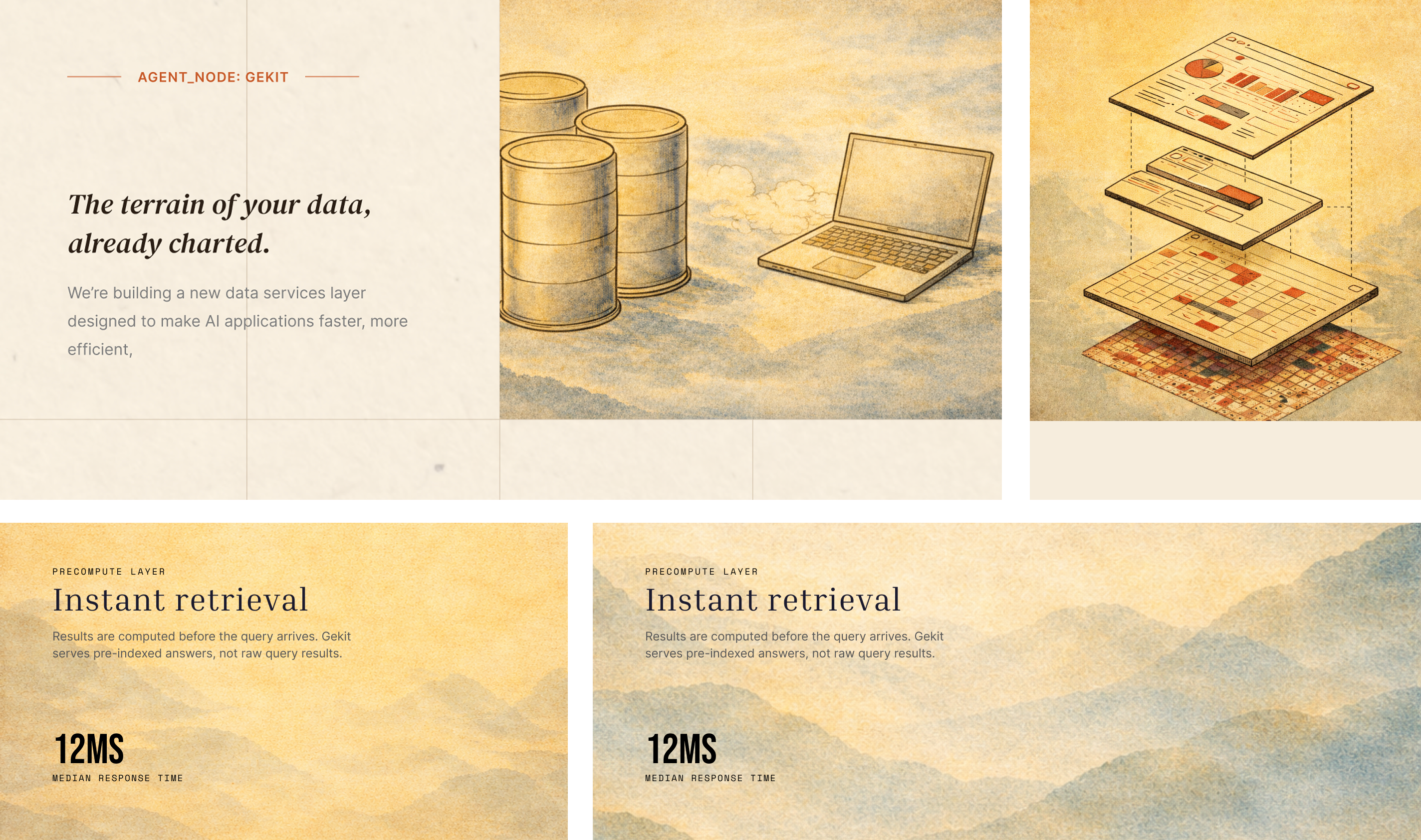
Gekit is a developer platform built on the idea of layers — data, models, and context stacked into something coherent. Every concept chased the same tension: make it feel genuinely technical, but unmistakably human. So we looked to the human-made technical artifacts that have always carried that balance — maps, stamps, seals, and hand-drawn technical illustration — things that are precise and systematic, yet clearly made by a person.
We explored five complete identity directions before landing on the final system. Each one is shown here in full — logo, palette, type, and real-world application — so you can see how the idea evolved from one option to the next.
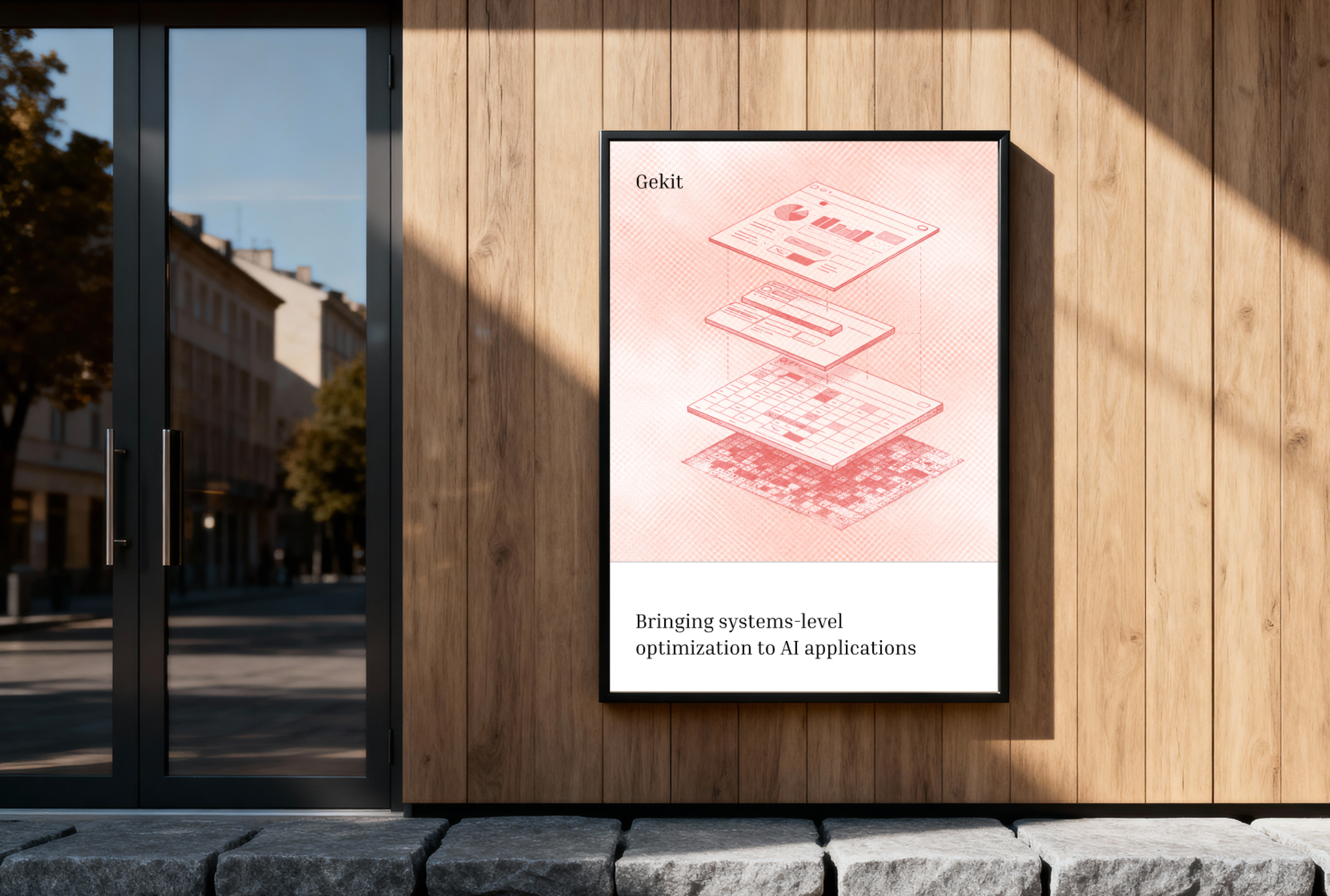
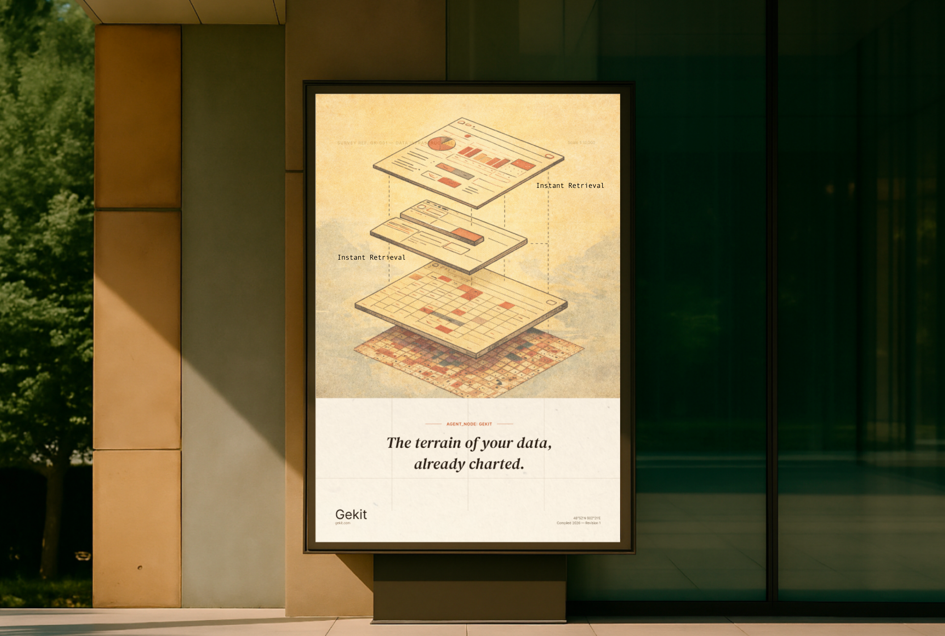
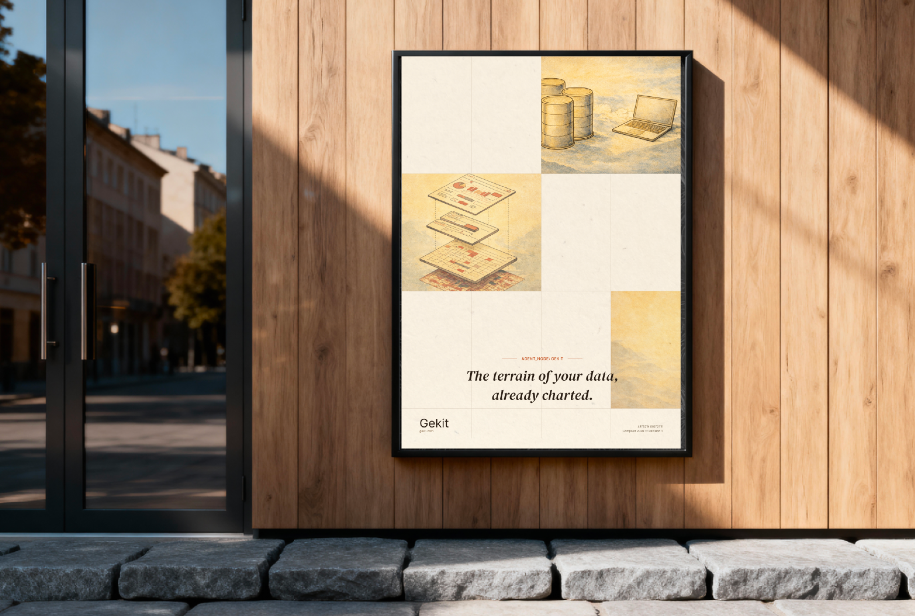
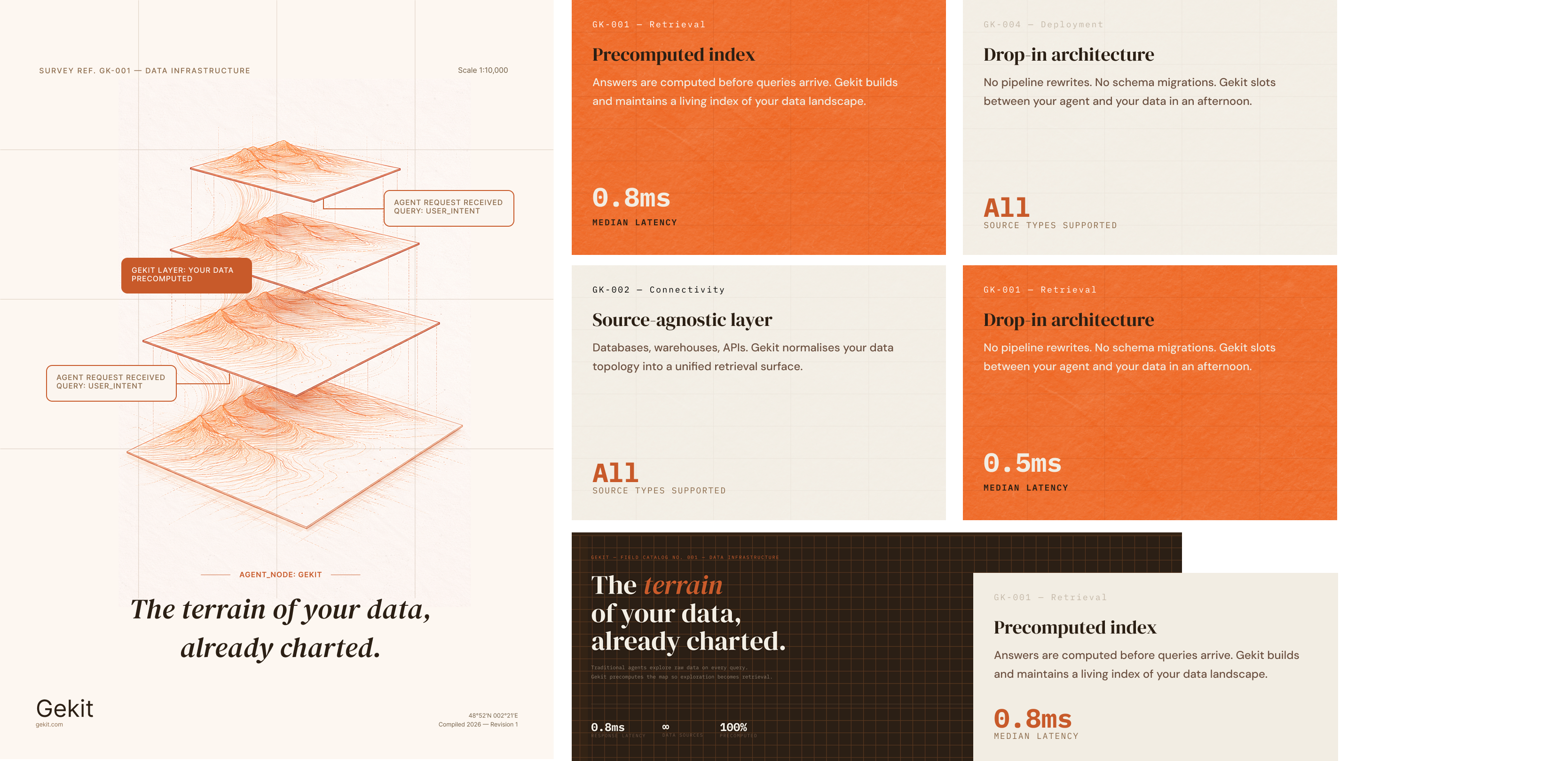
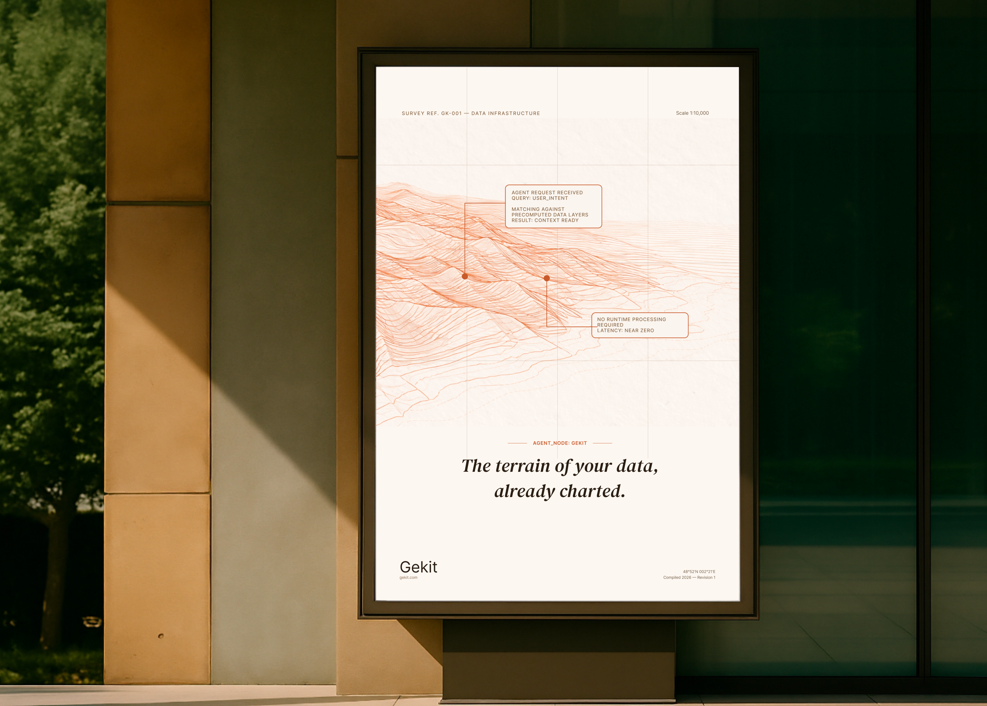
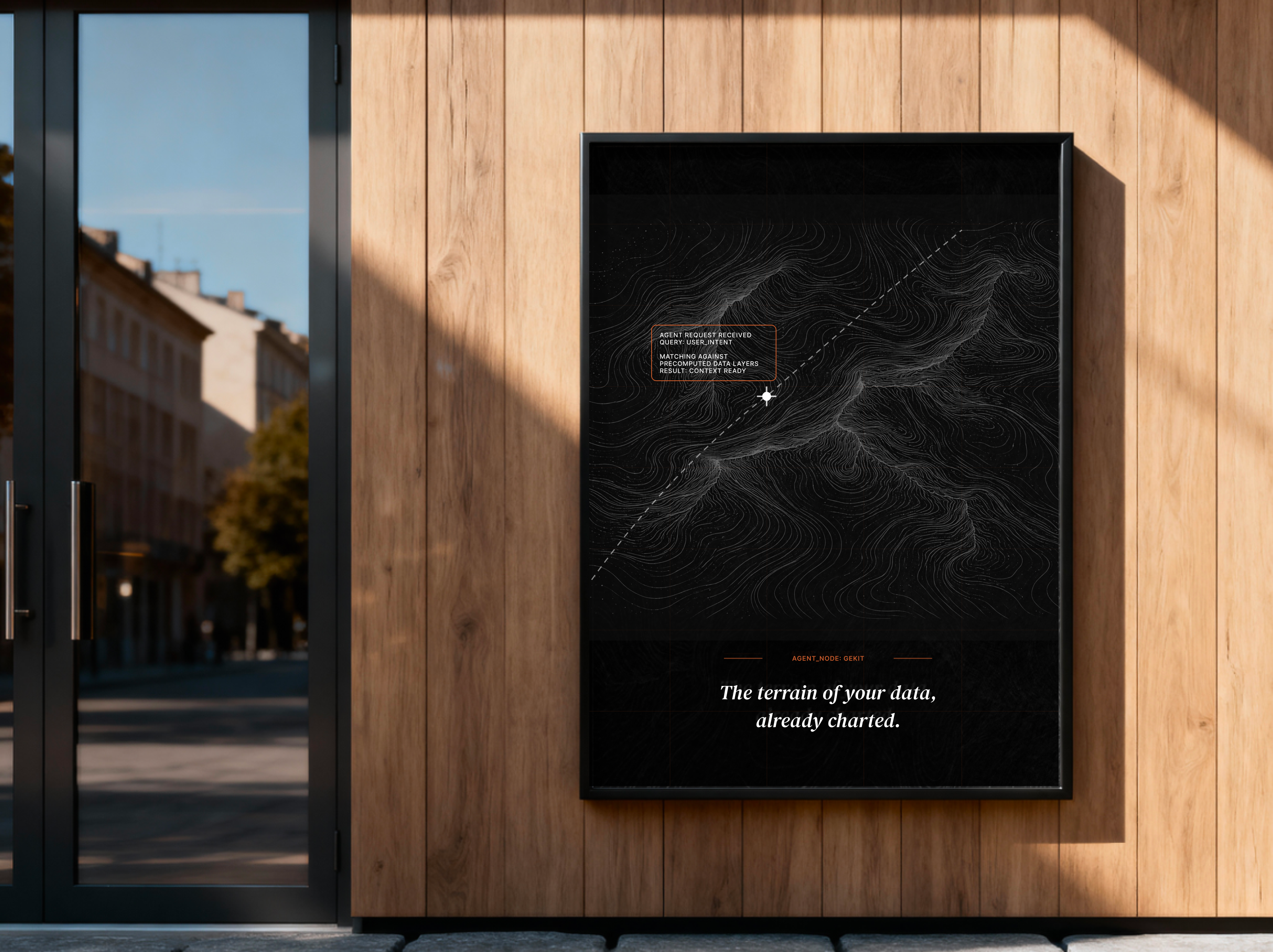
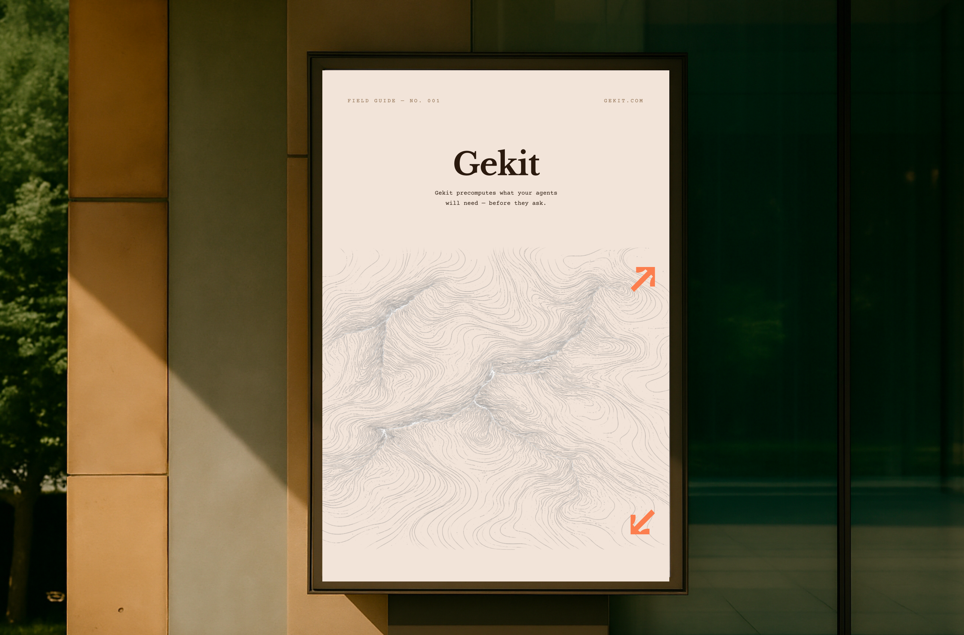
Inspired by cartography — the layered mark drawn like contour lines on a topographic map, set in warm, paper-like neutrals. "The terrain of your data, already charted." Technical, but with the warmth of something hand-surveyed.
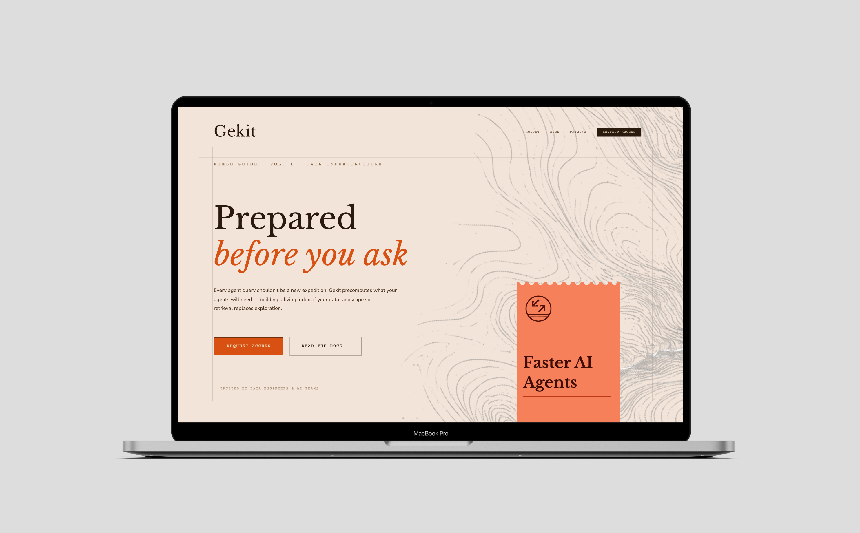
The same cartographic logic pulled toward the precision of a survey drawing — cleaner planes, more white space, and a tighter, more technical hand. Still human, but more engineered.

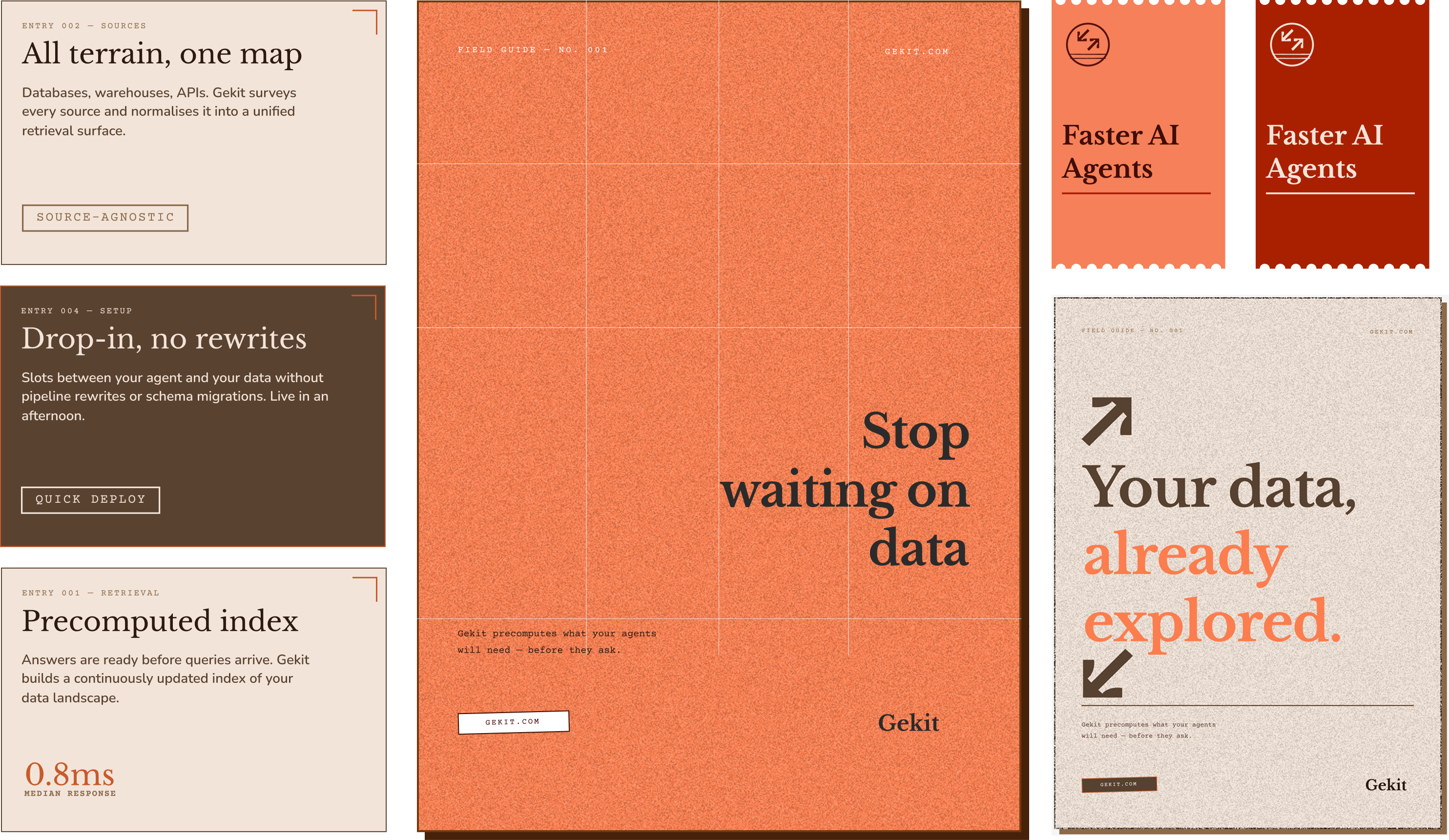
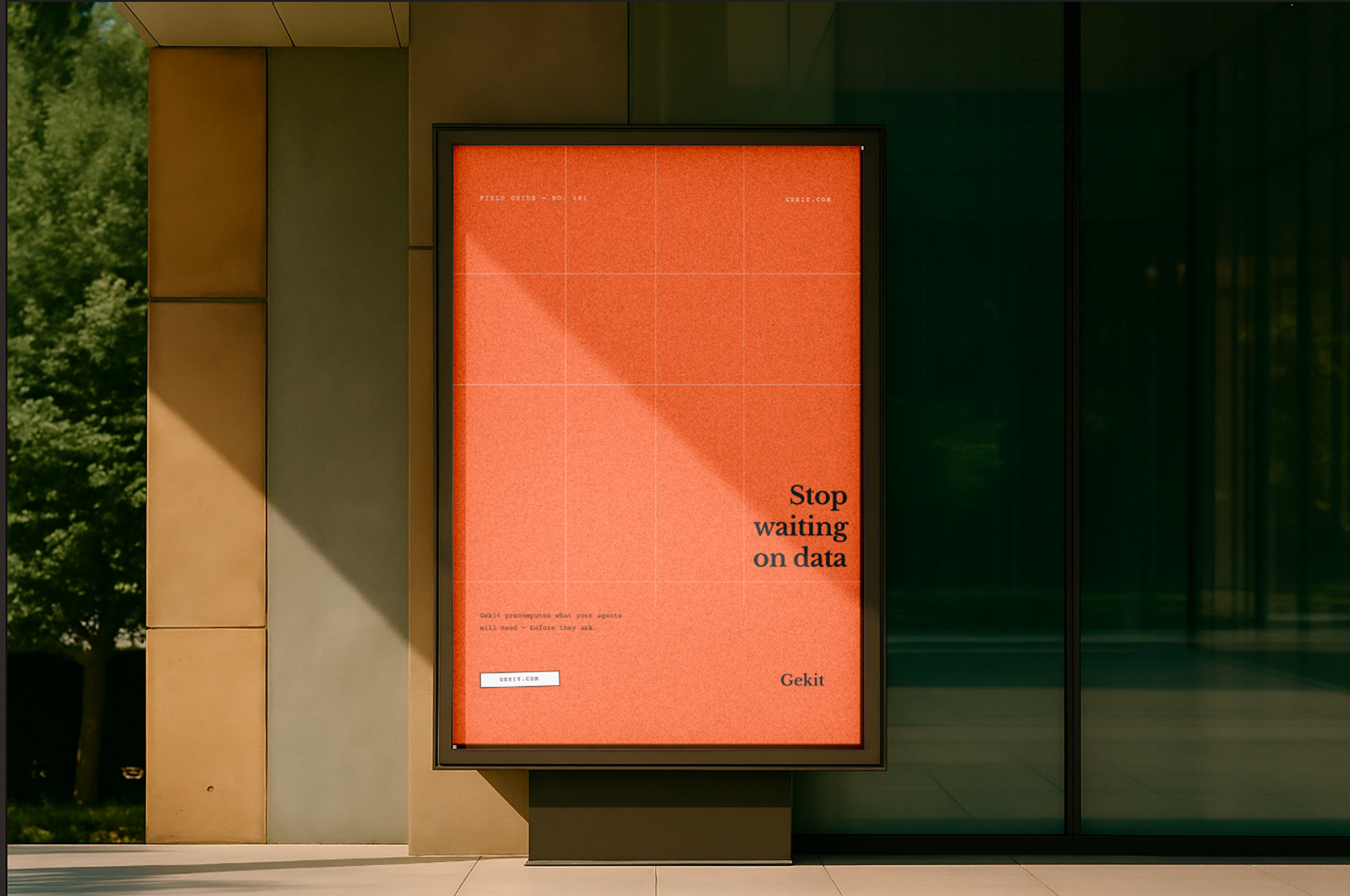
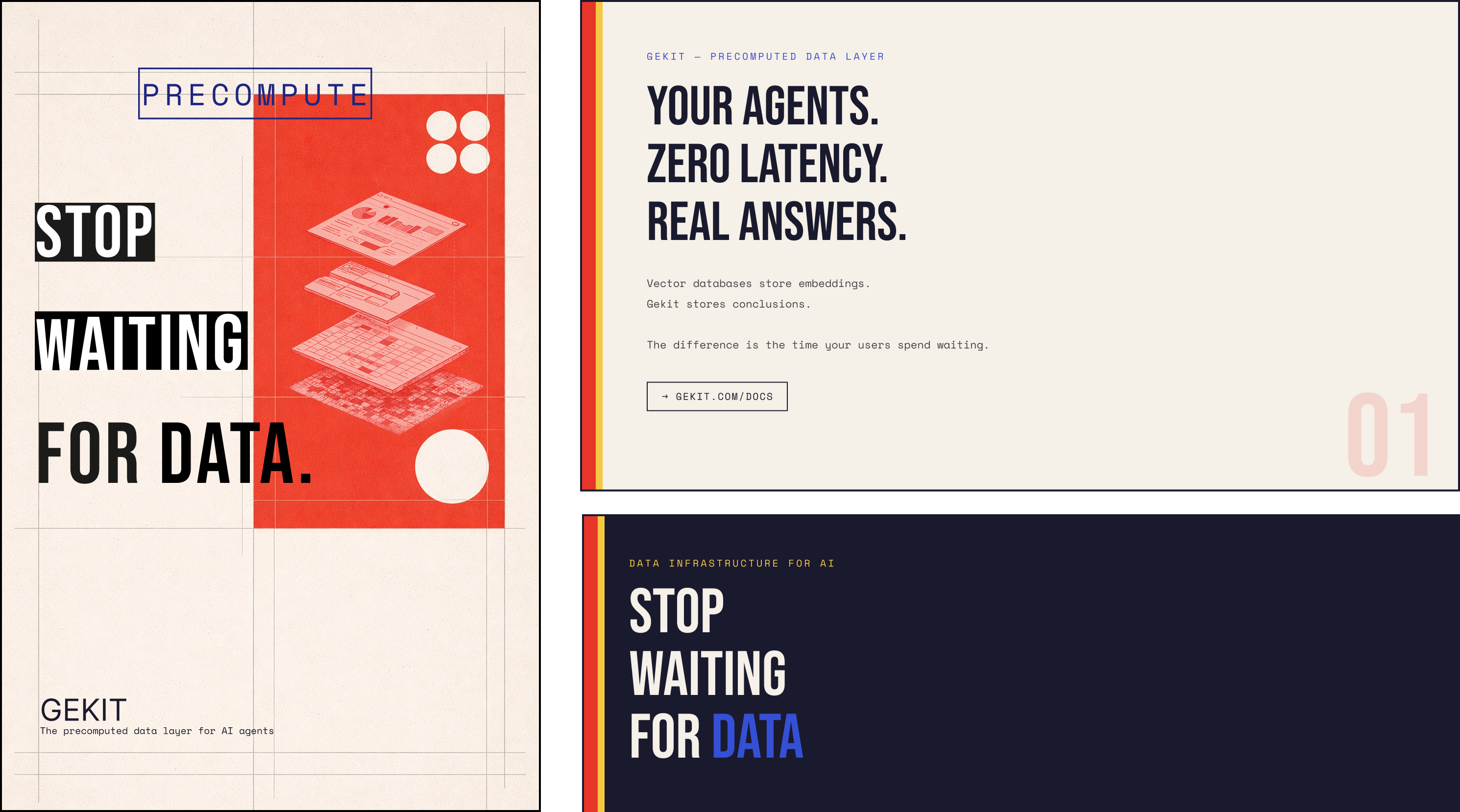
A louder, more human voice — saturated orange and oversized, conversational type. The technical layers stay, but the personality is turned all the way up, like a poster pinned up by someone who cares.

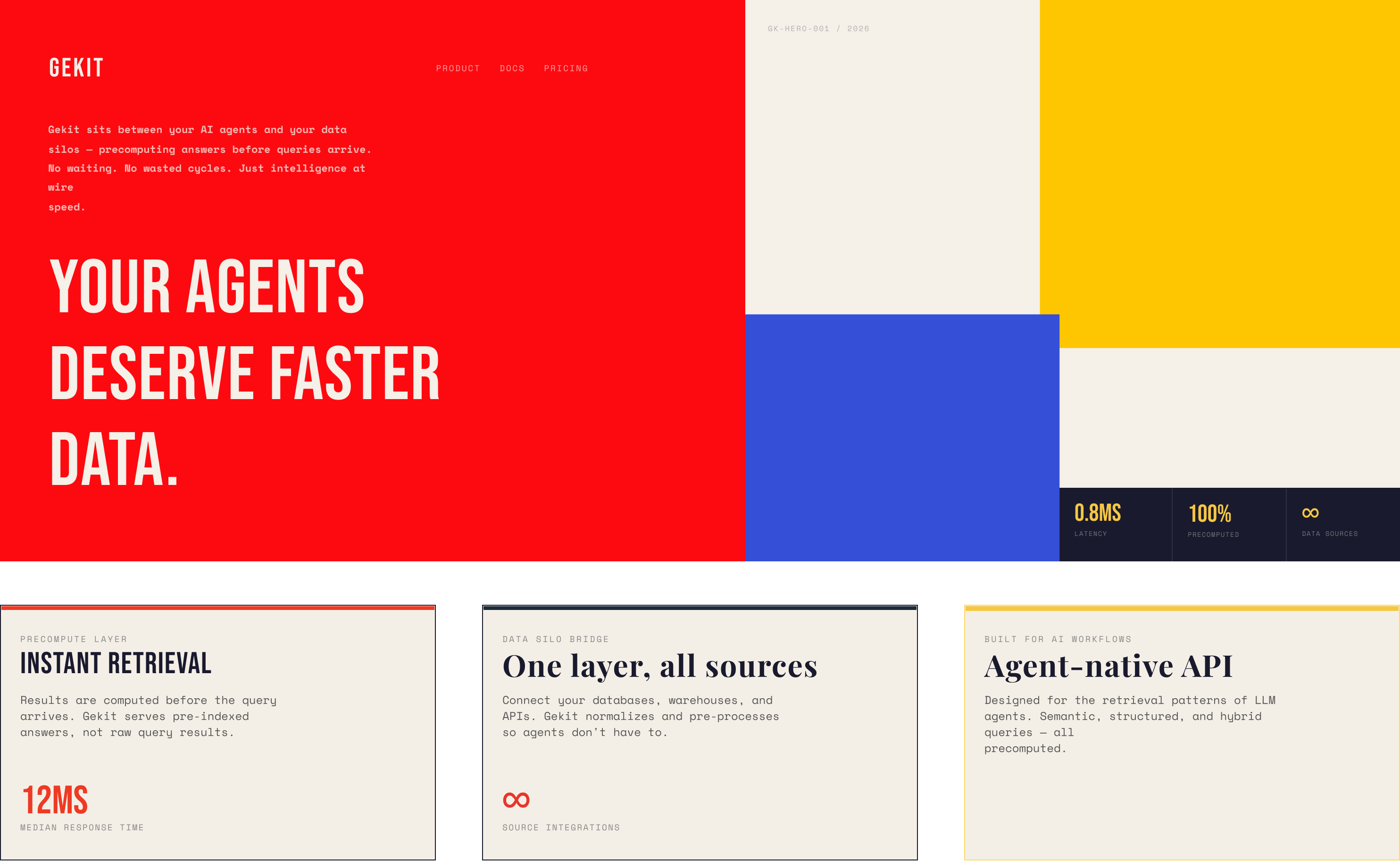
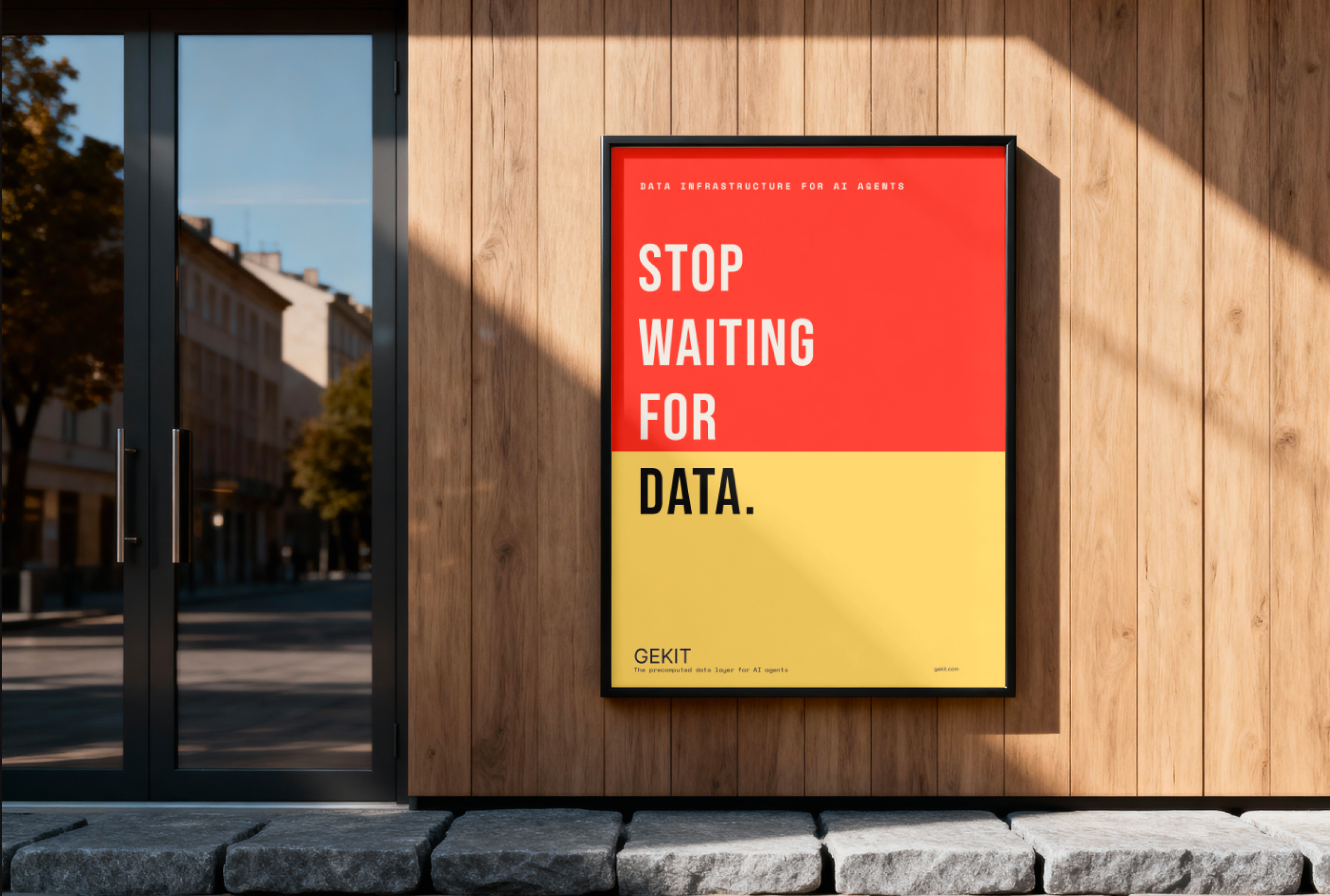
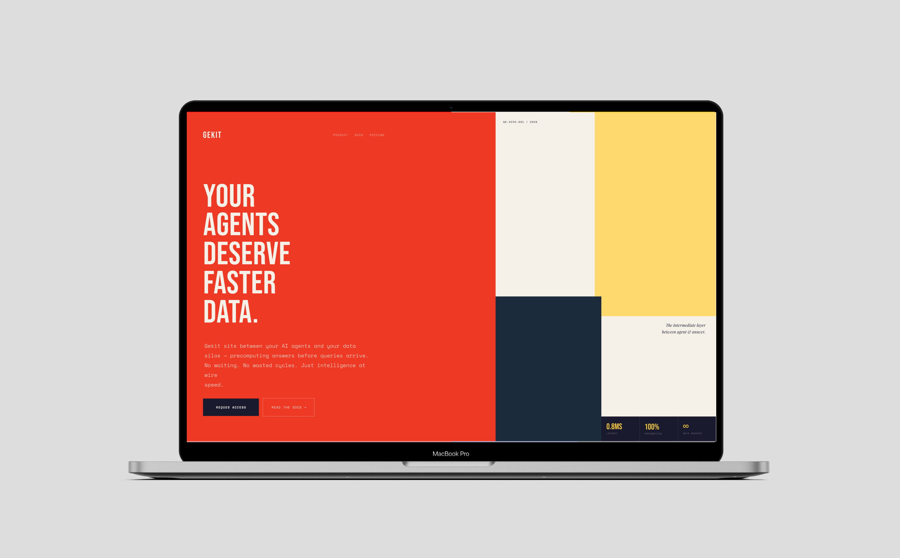
A primary-color, Bauhaus-leaning system of bold blocks and geometric rigour — where the human touch comes from craft and composition rather than warmth of palette. Systematic, but composed by hand.
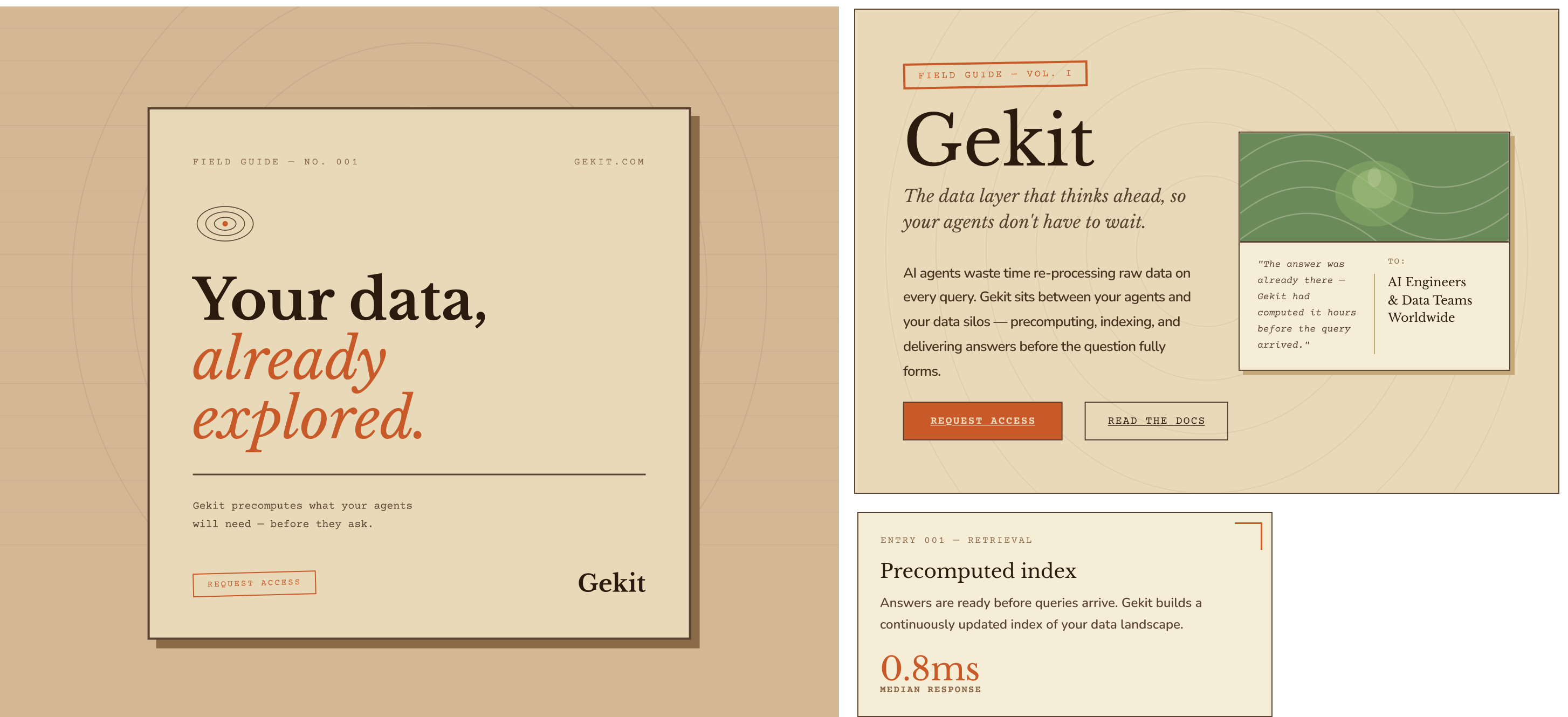
Inspired by stamps and seals — a refined wordmark paired with a hand-pressed emblem and soft cream stationery tones. The most tactile and human direction, like something authored, stamped, and signed by hand.
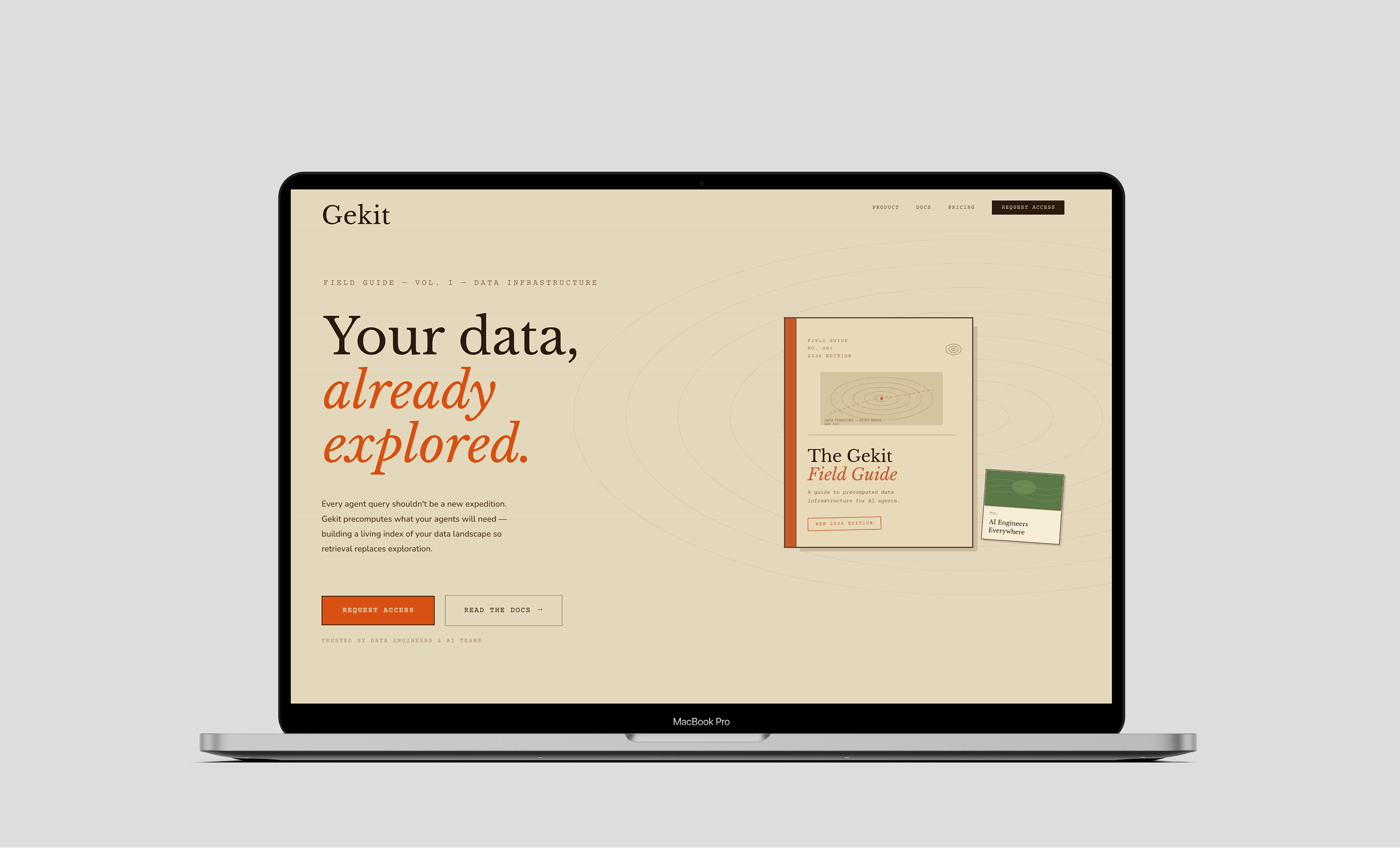

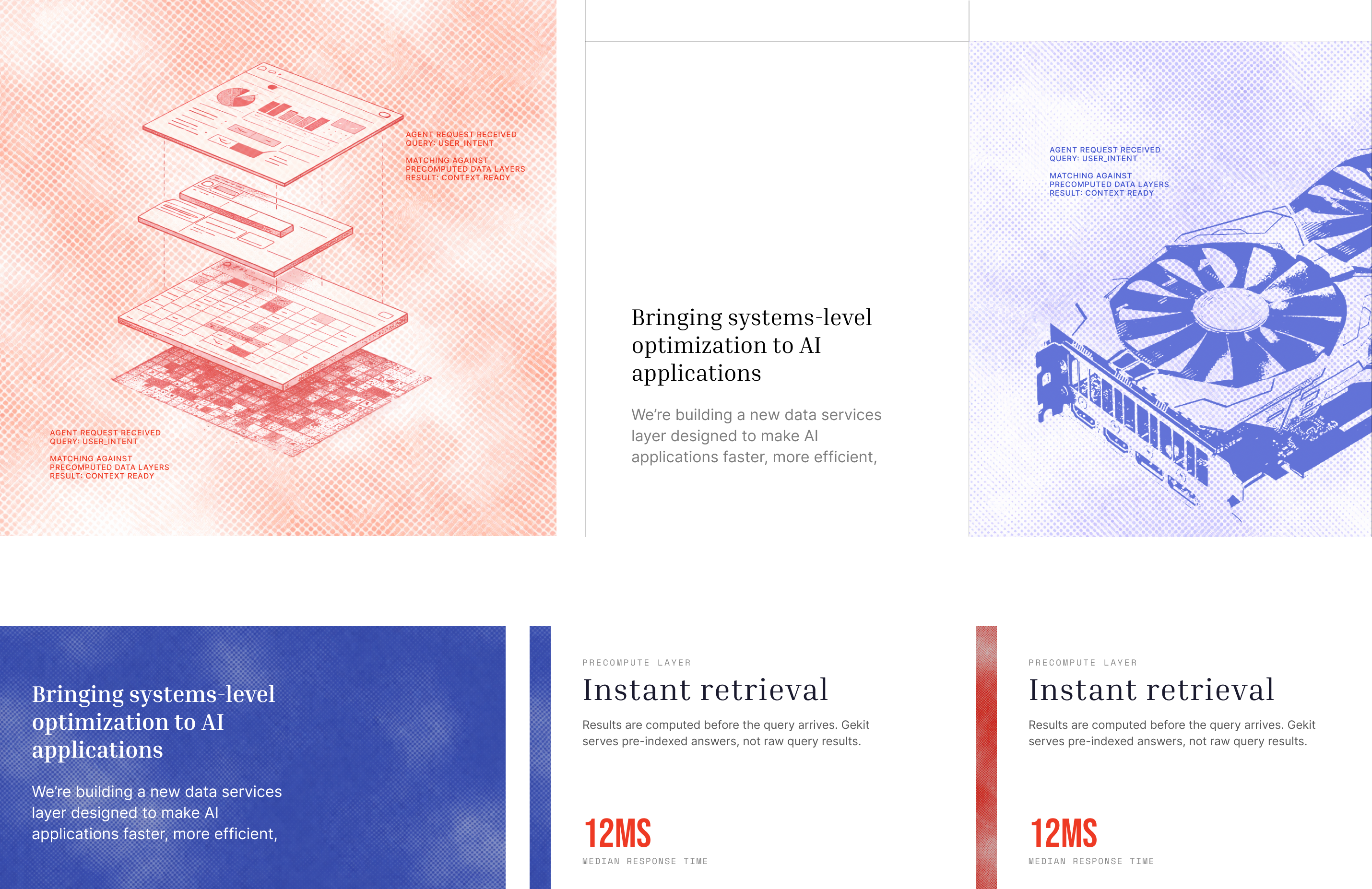
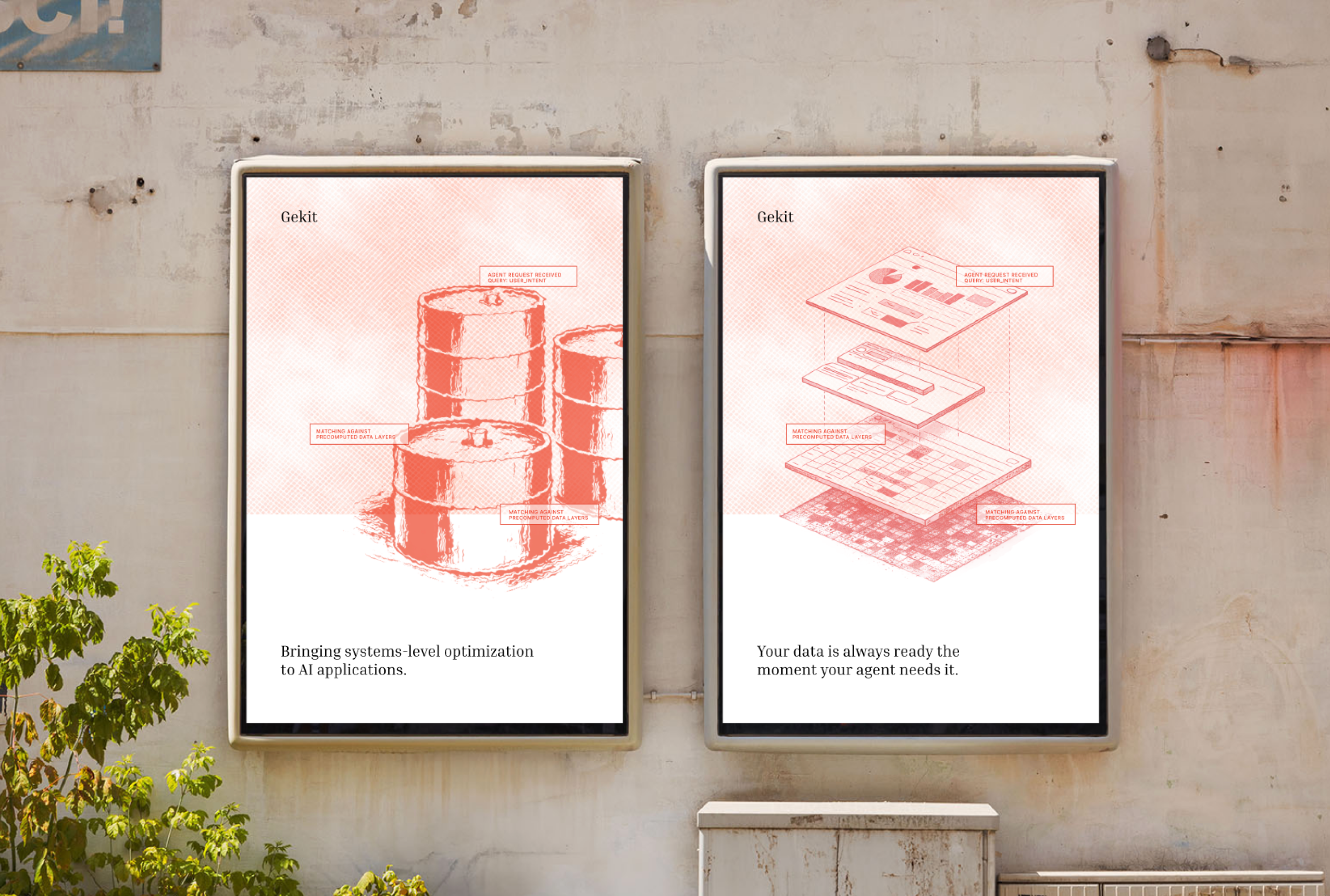
The final identity is built on old technical drawings — exploded, hand-rendered isometric diagrams of the layers — colored in the inks of old printers and pens: faded sepia, iron-gall blue, and oxidized red. It's the clearest expression of the whole brief: rigorously technical, yet warmed by the visible hand that drew it.

final images coming soon...