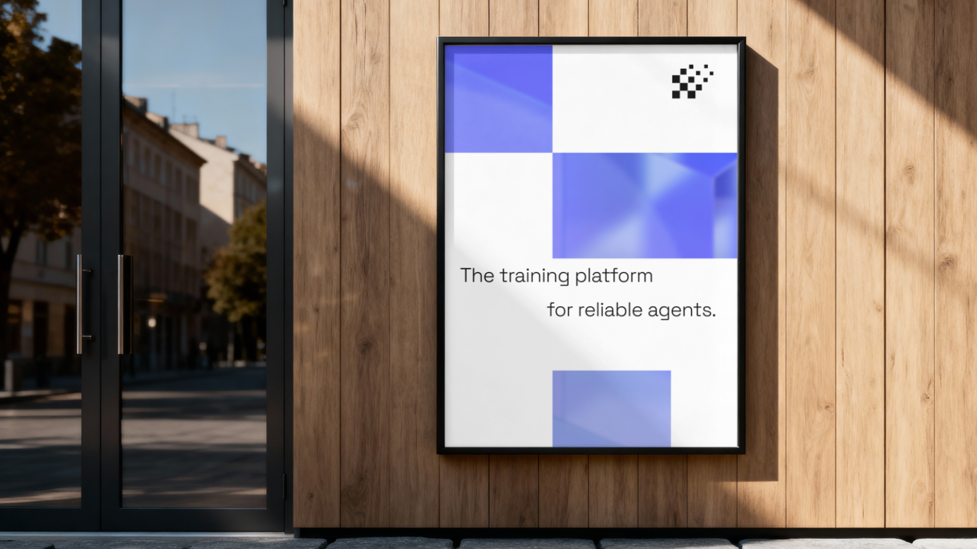
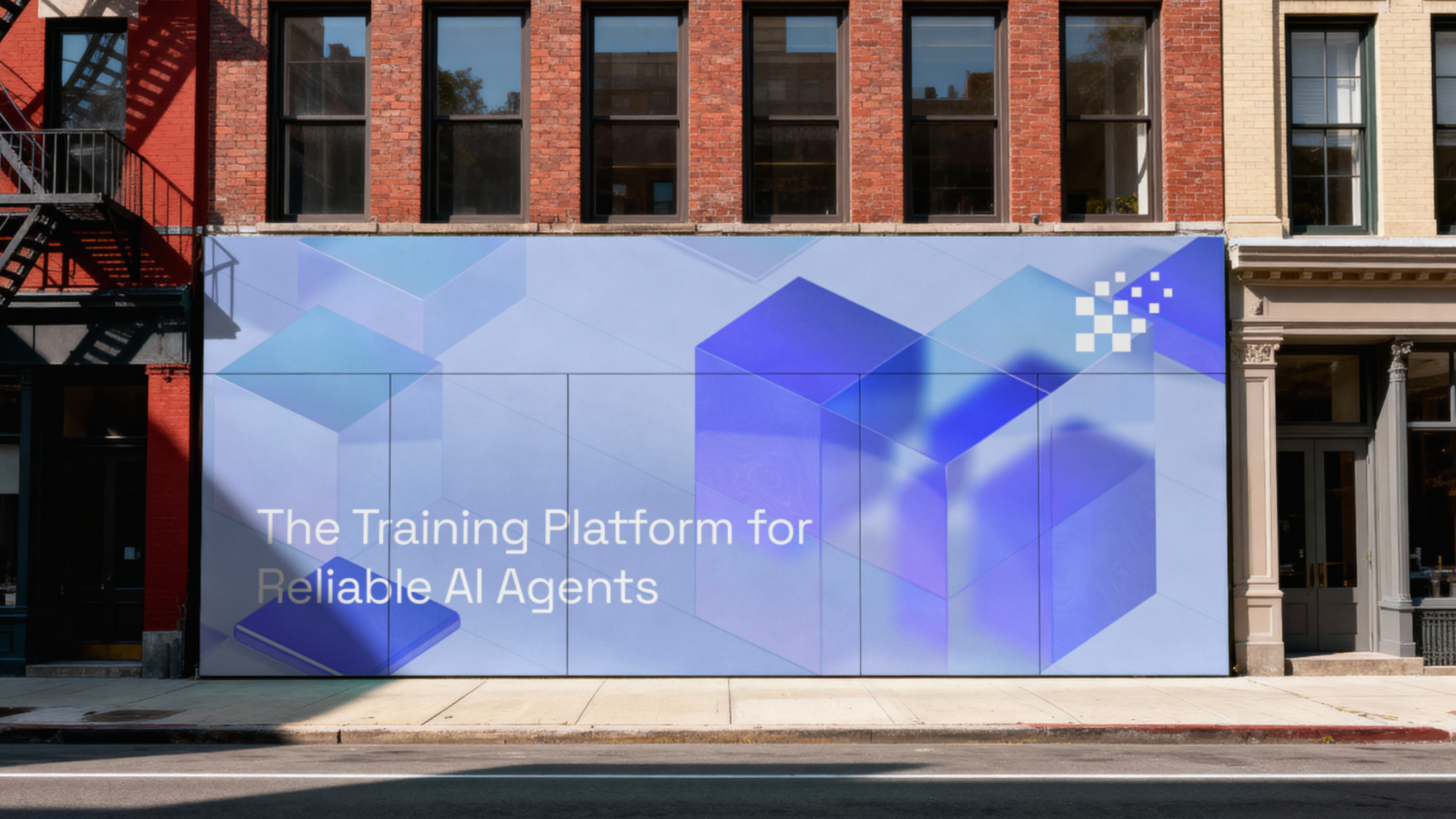
Lucidic is the training platform for reliable AI agents — infrastructure for teams who need their agents to behave predictably once they hit production. The brand had to feel genuinely technical and trustworthy, but alive enough to stand apart in a sea of flat, interchangeable AI logos.
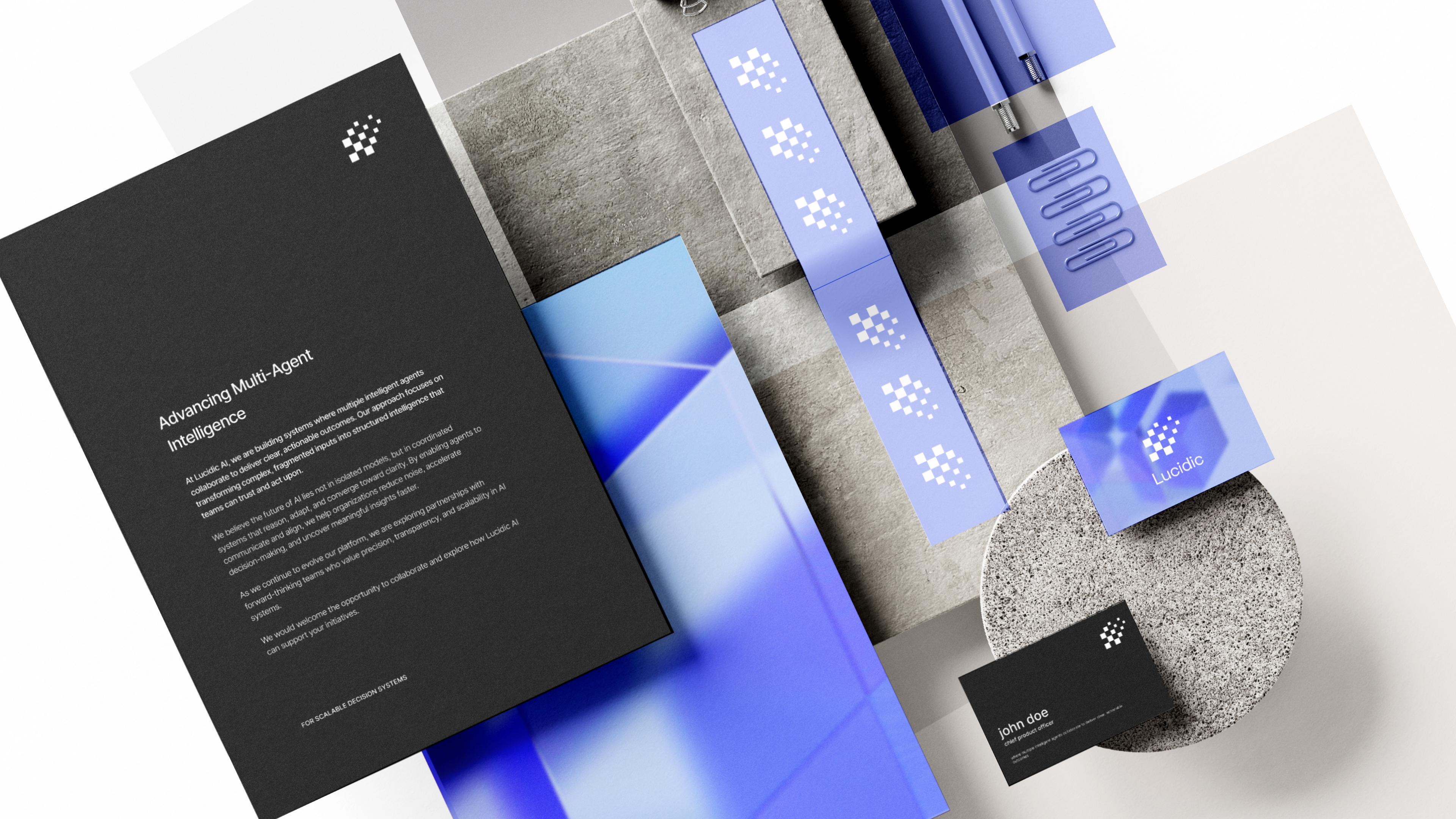
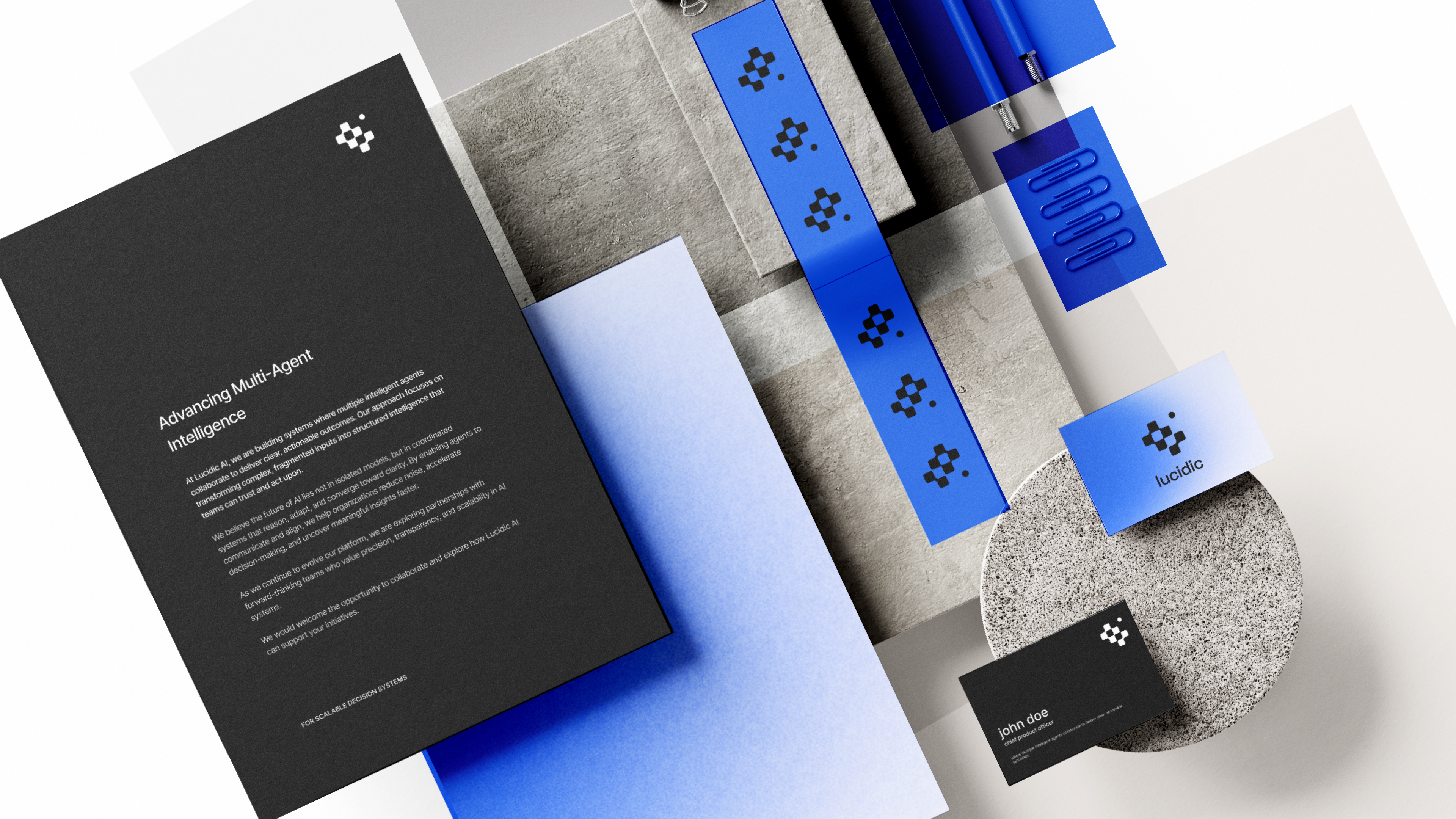
We ran four complete identity explorations before arriving at the final mark. Each direction is shown here in full — logo, palette, type, and real-world application — so you can see how the system evolved from one option to the next.
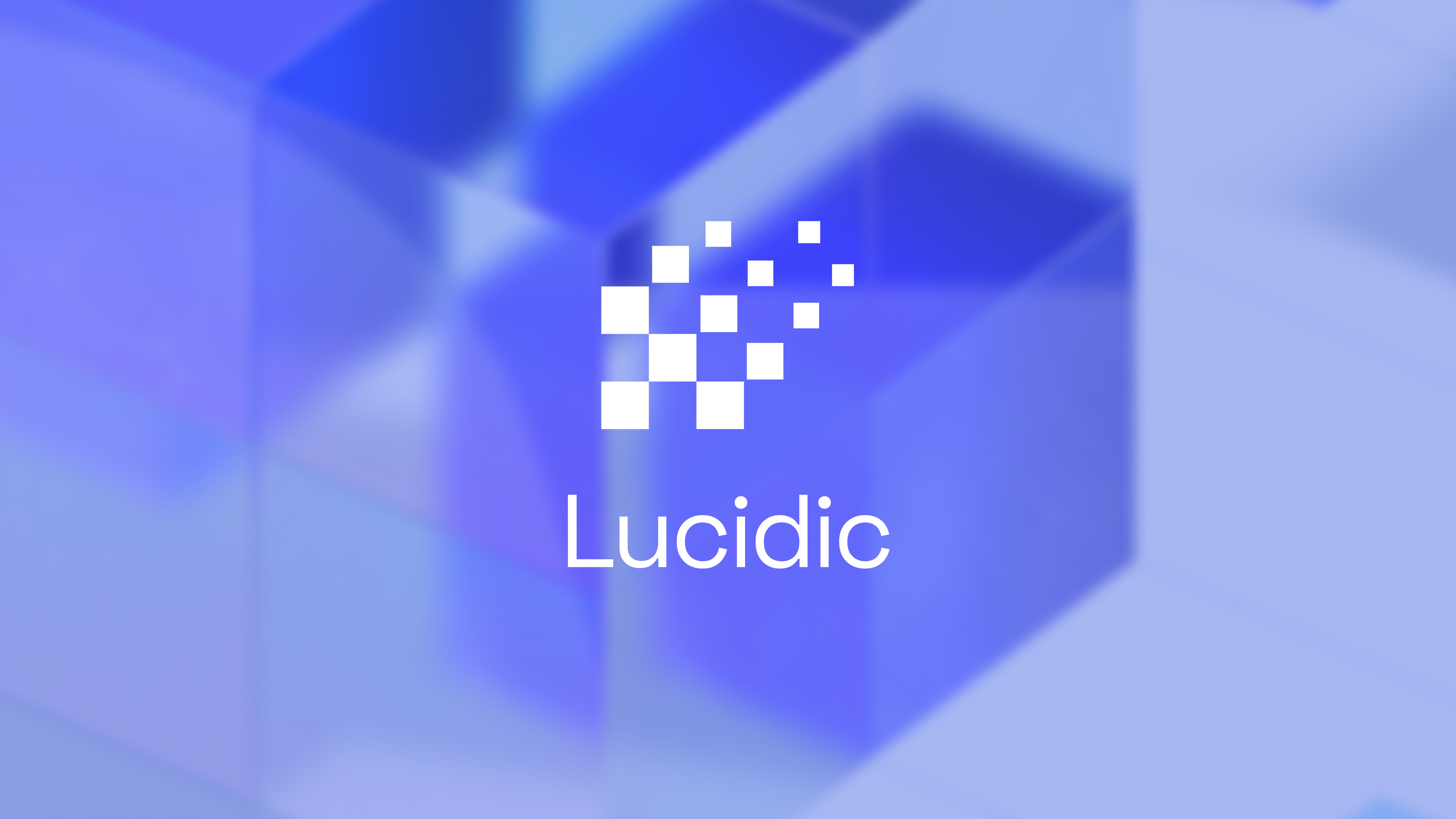
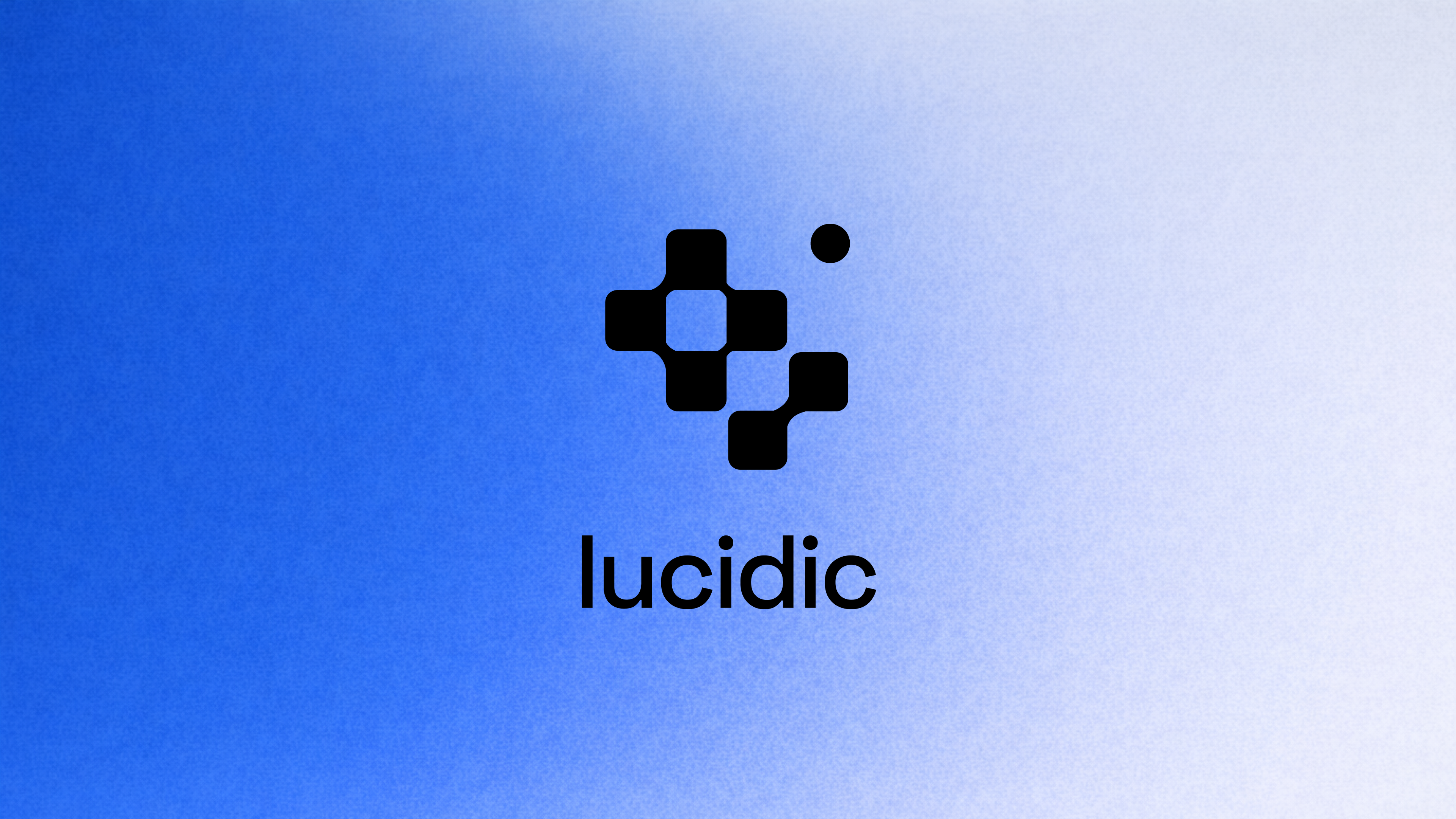
A soft periwinkle gradient paired with a dithered, pixel-built mark — a nod to the raw, low-level nature of model training. Approachable, but unmistakably engineered.

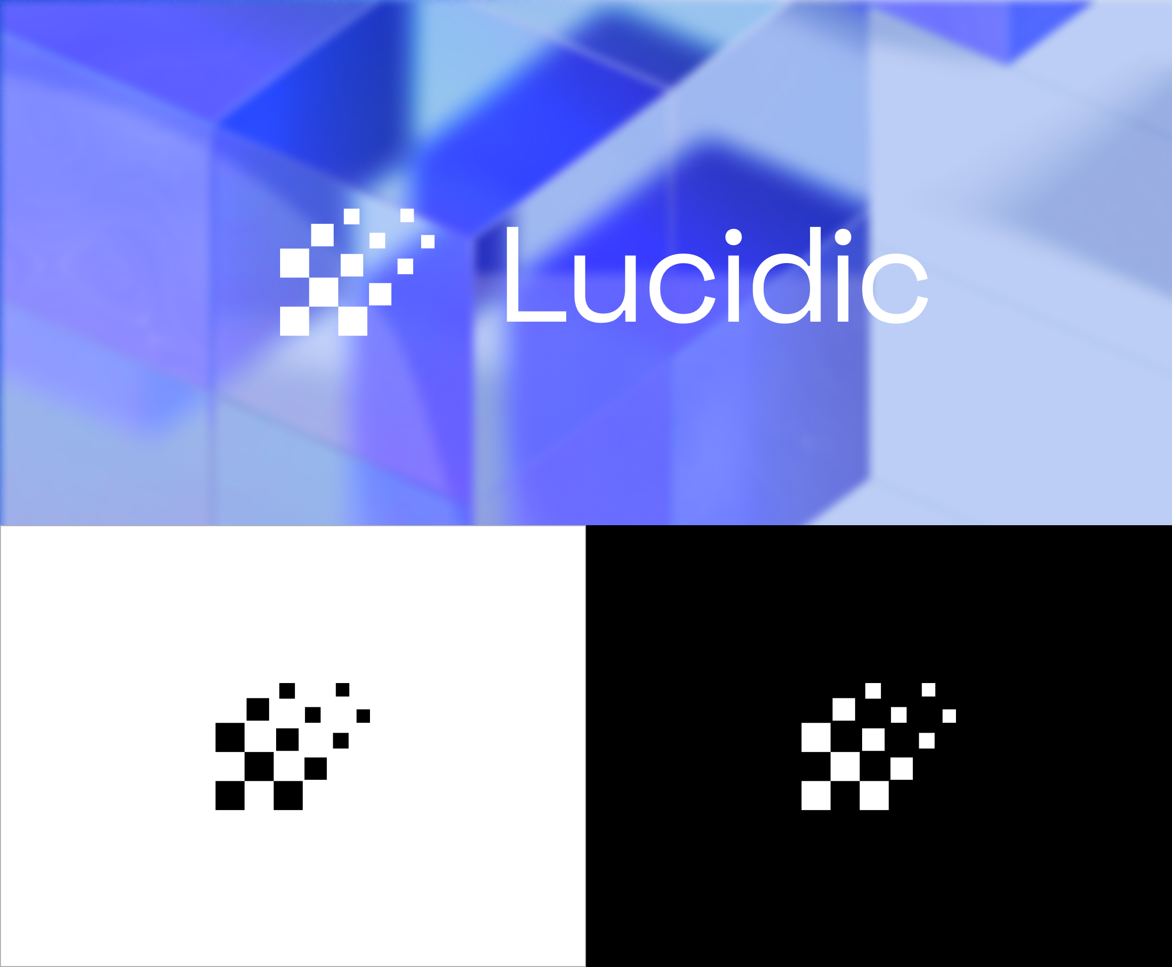
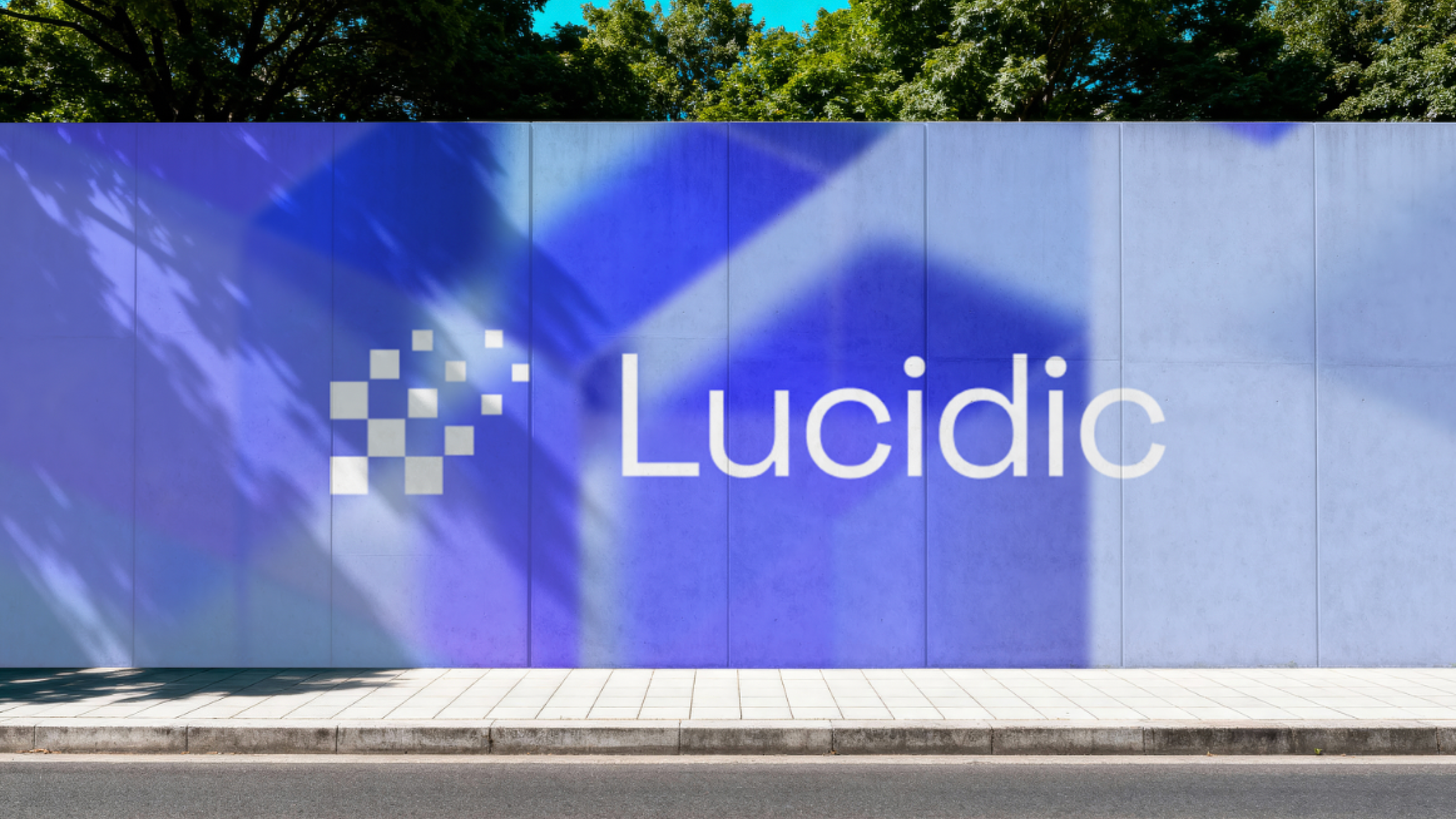
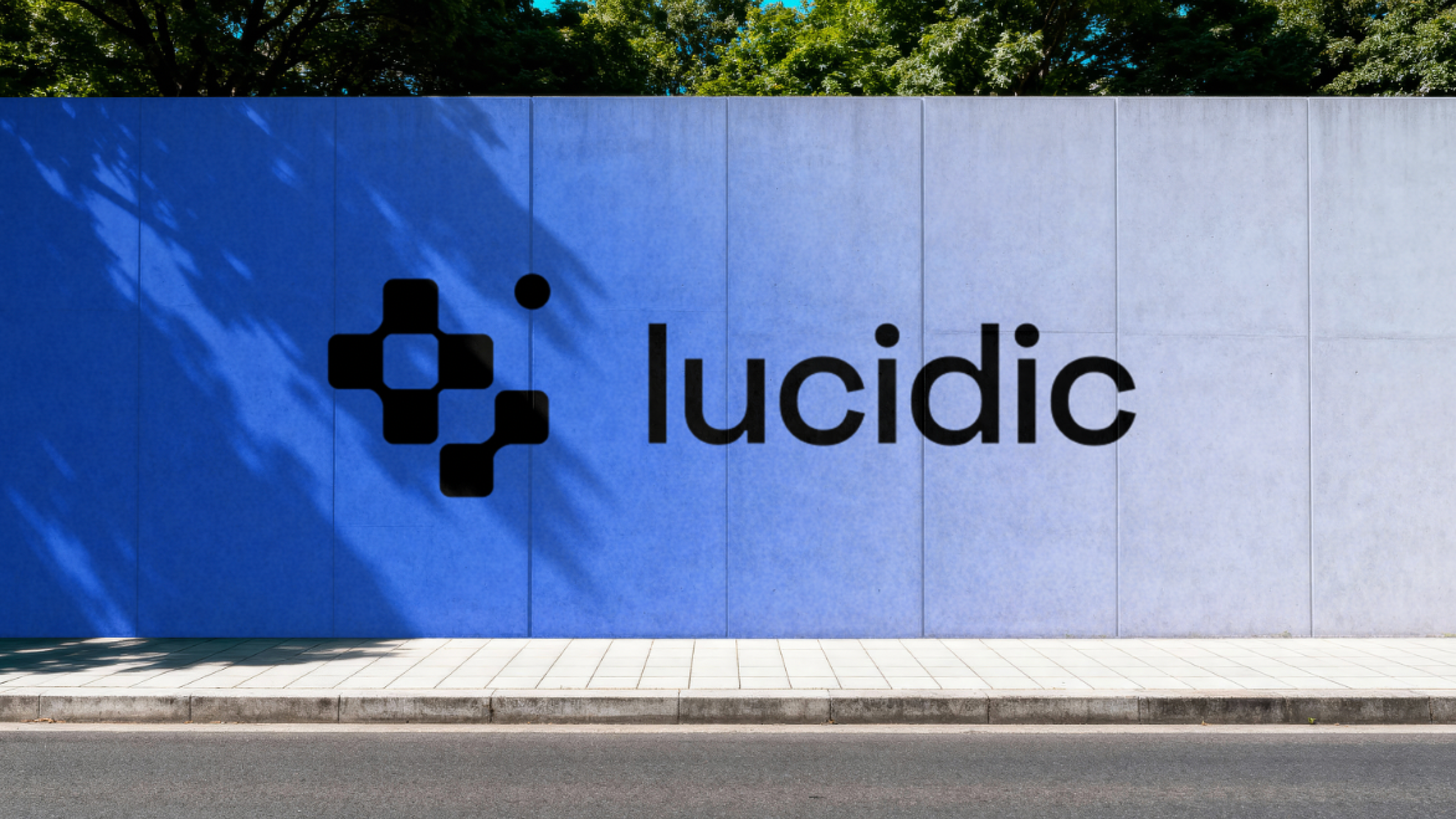
The same pixel logic, pushed sharper and more saturated. A confident electric blue and a tighter mark, stress-tested across signage, cards, and collateral.


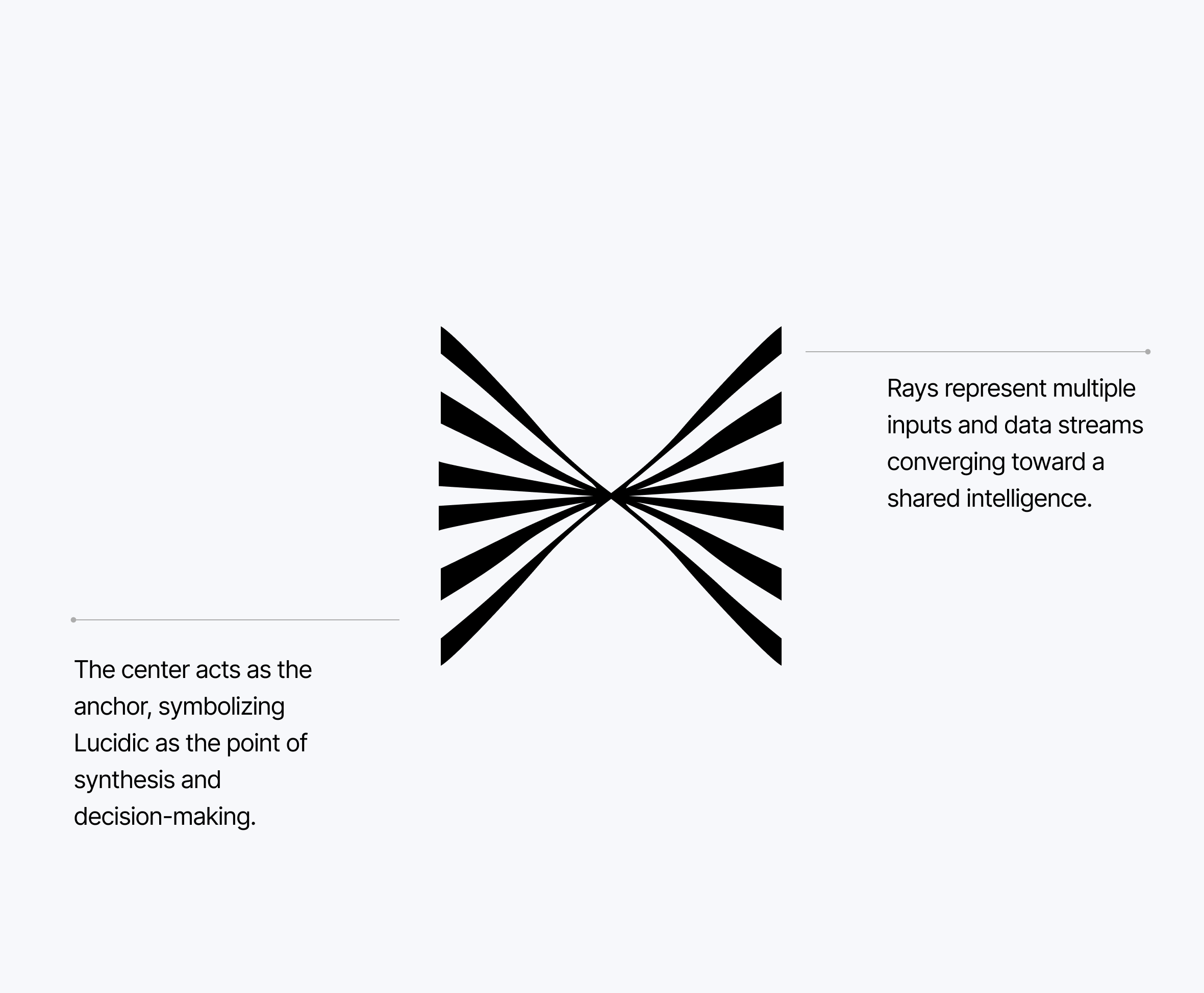
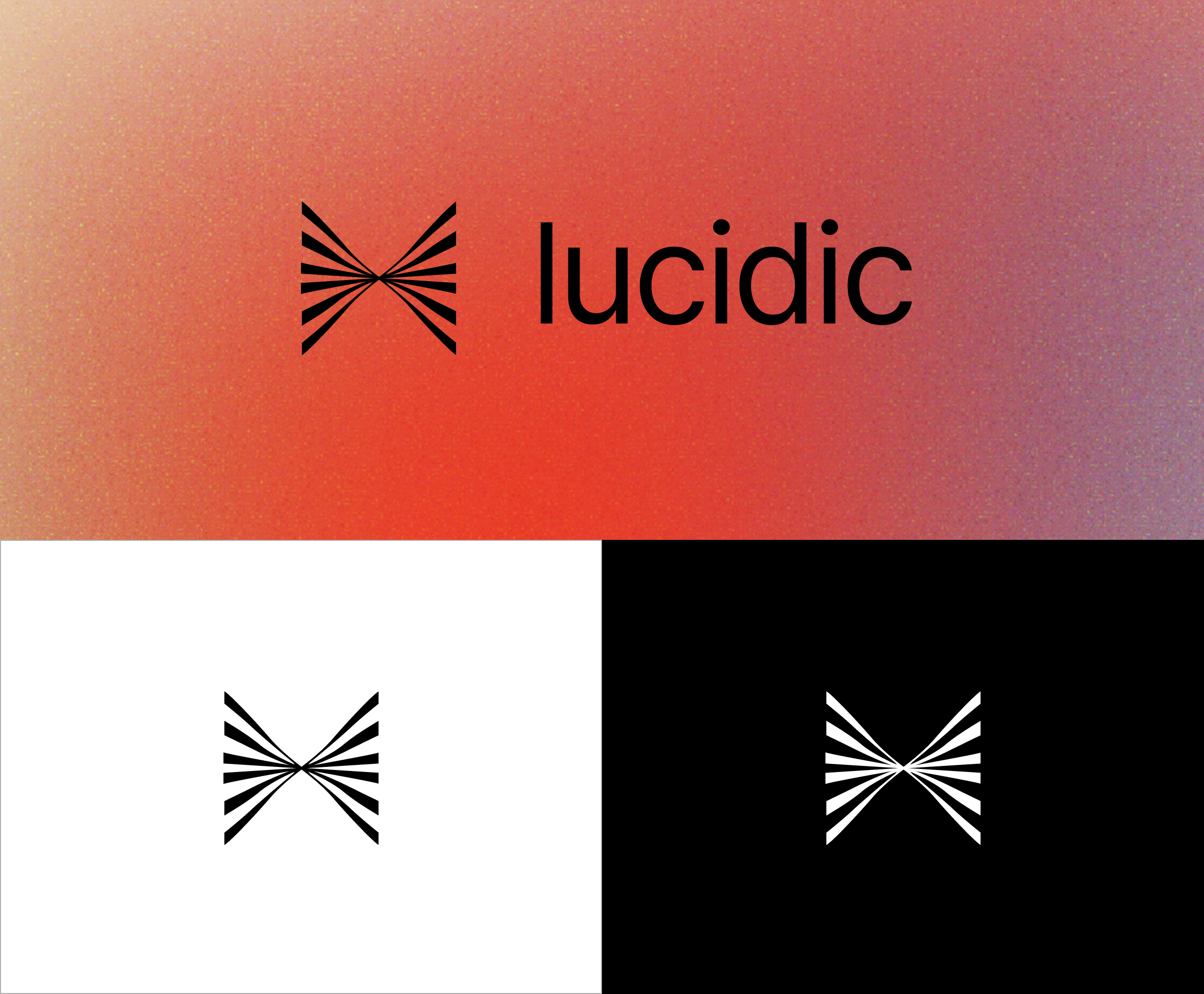
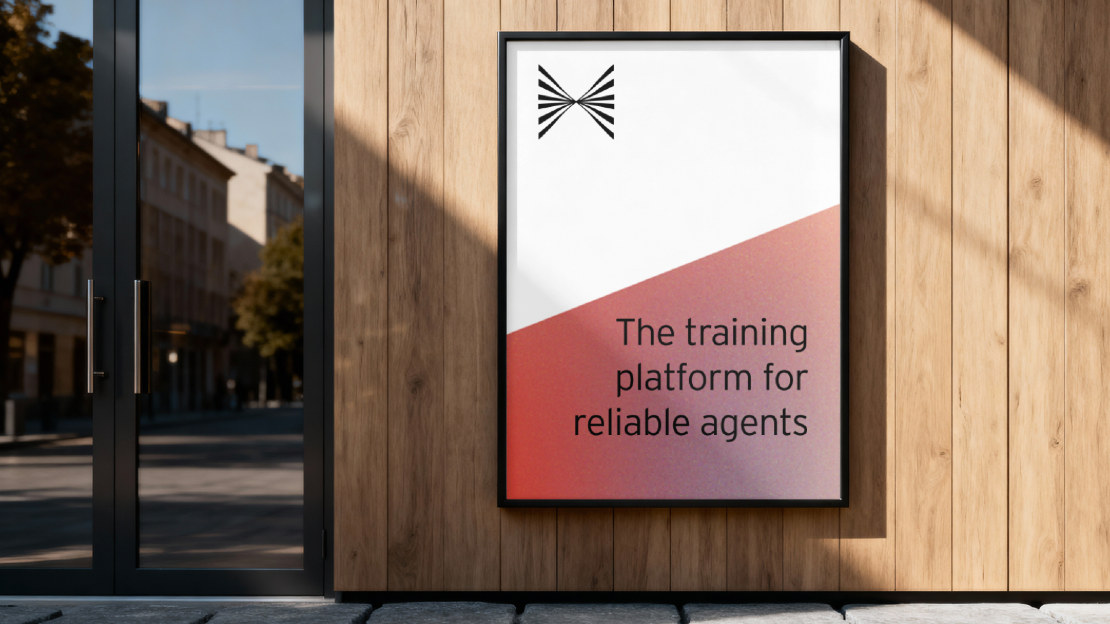
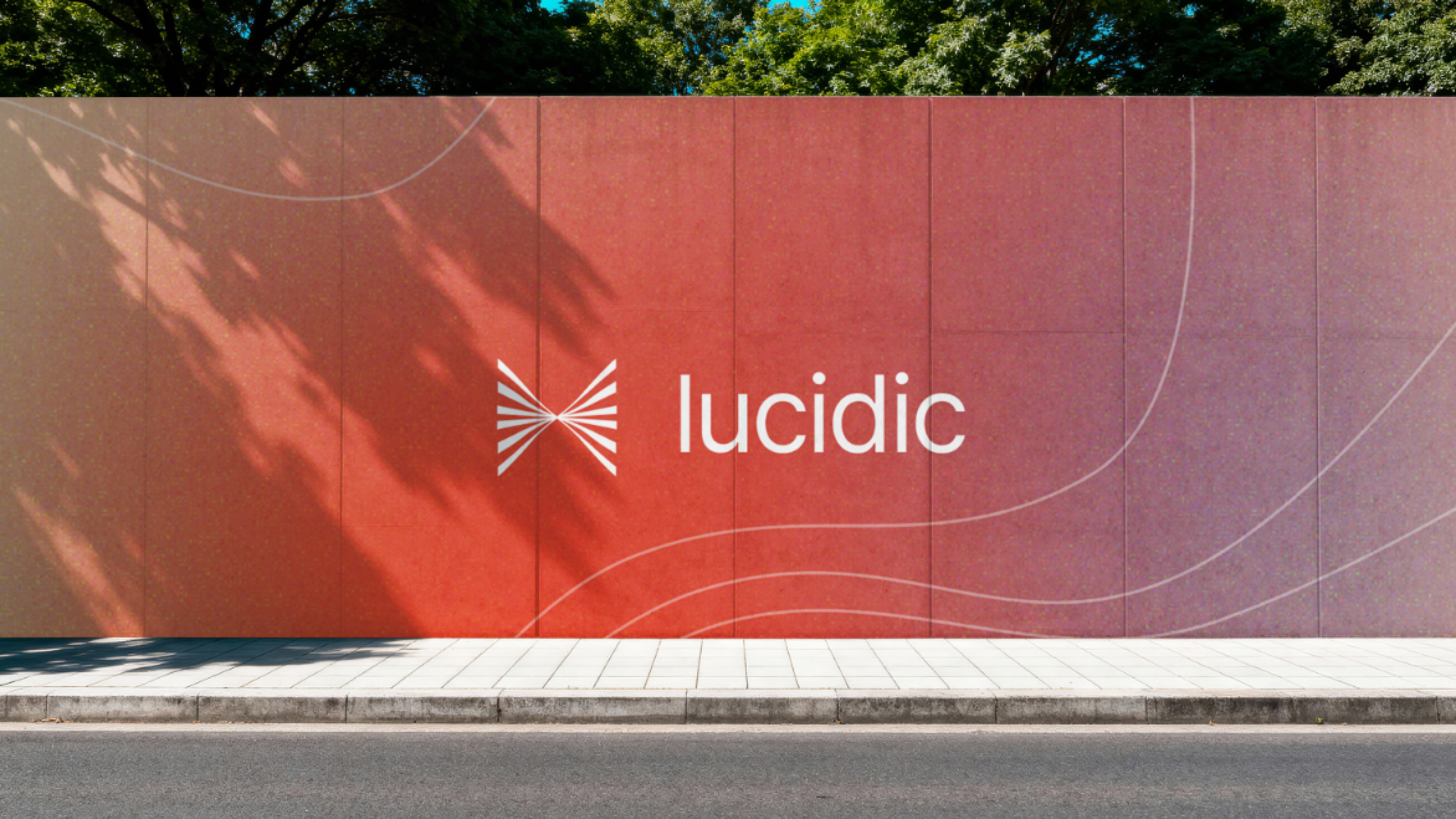
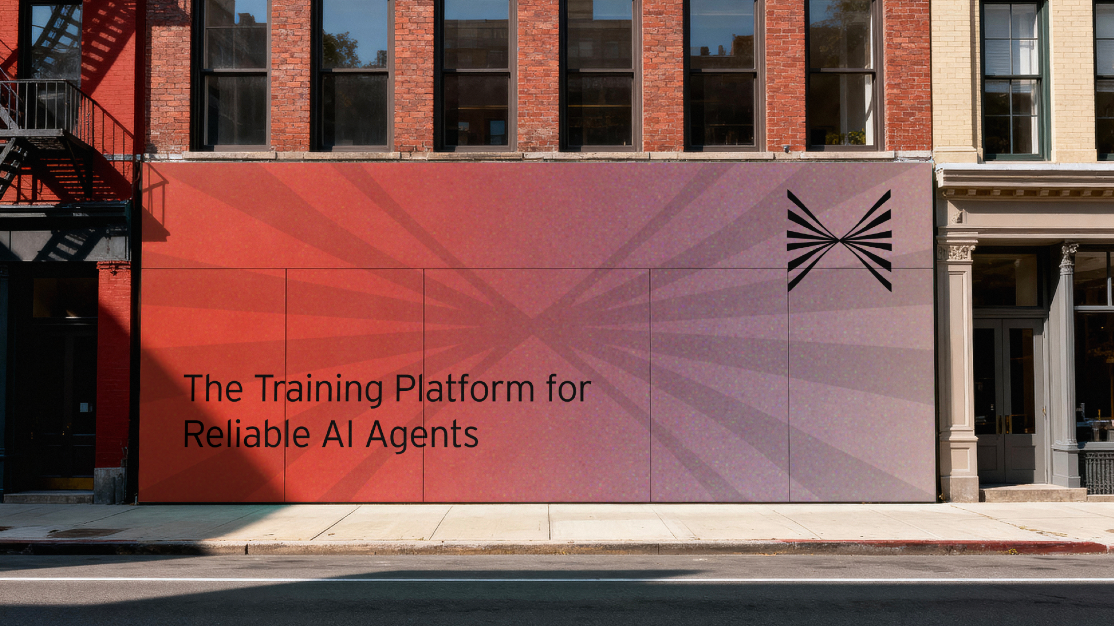
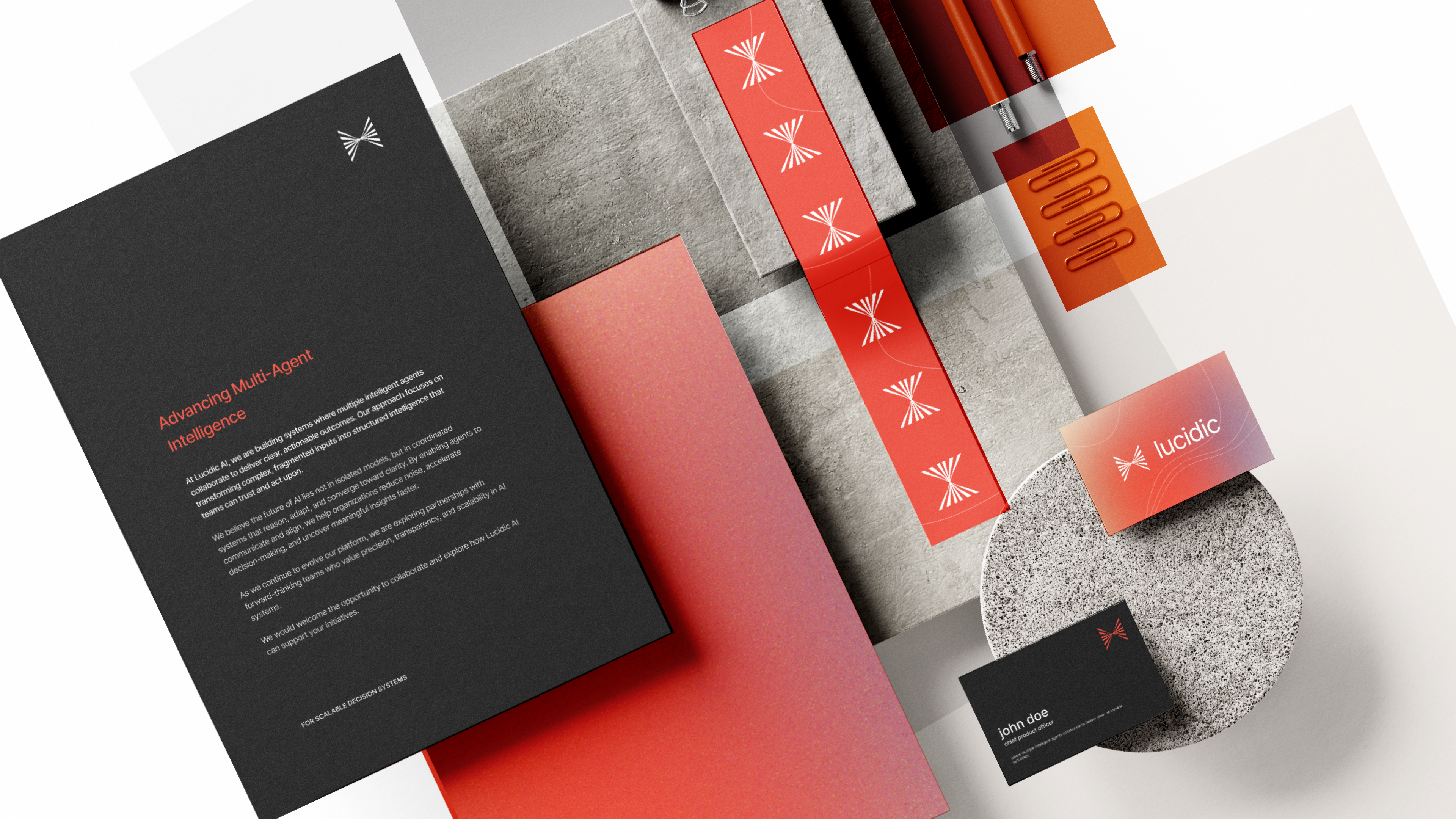
A complete shift in temperature — a warm, signal-red gradient and a kinetic, intersecting mark. Bolder and more editorial, with a human warmth the blues didn't have.

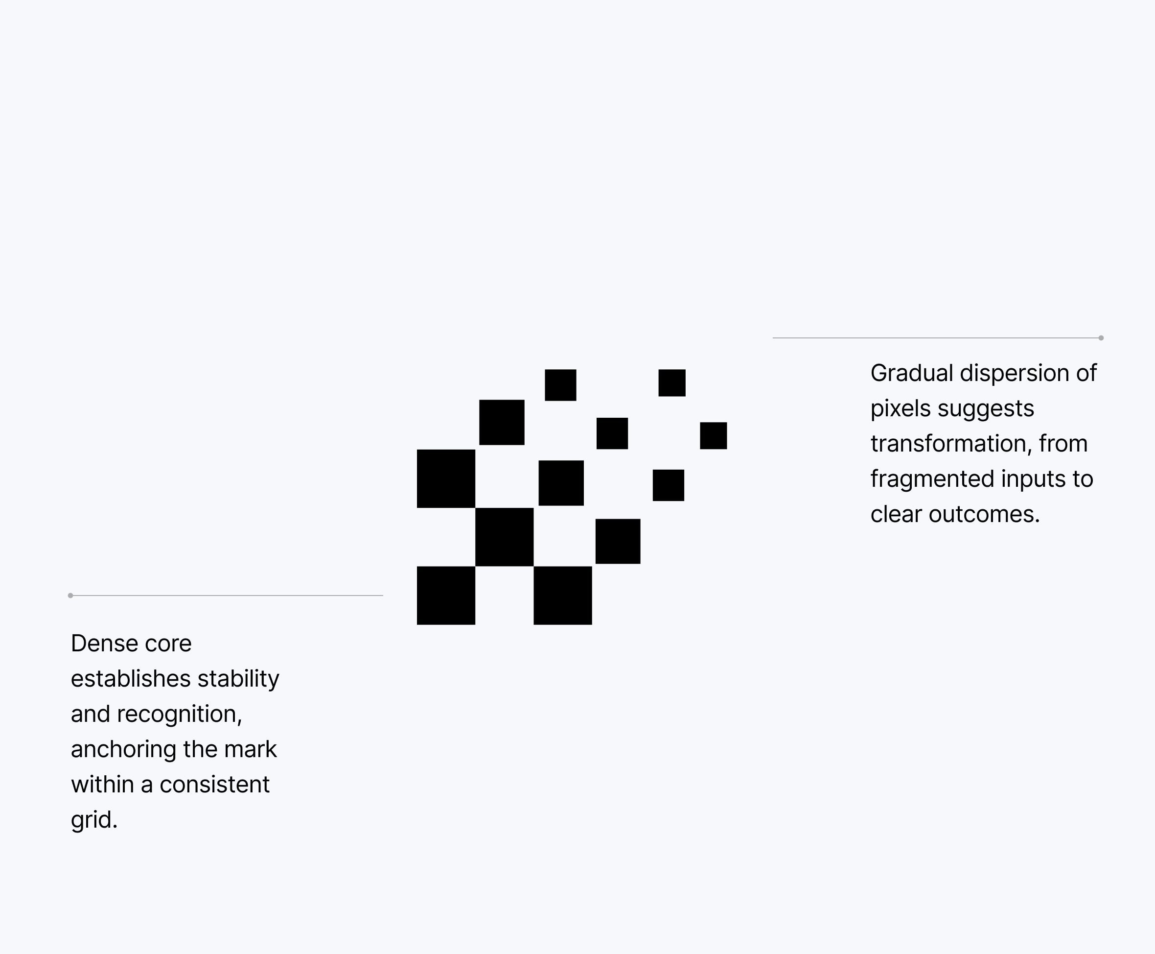
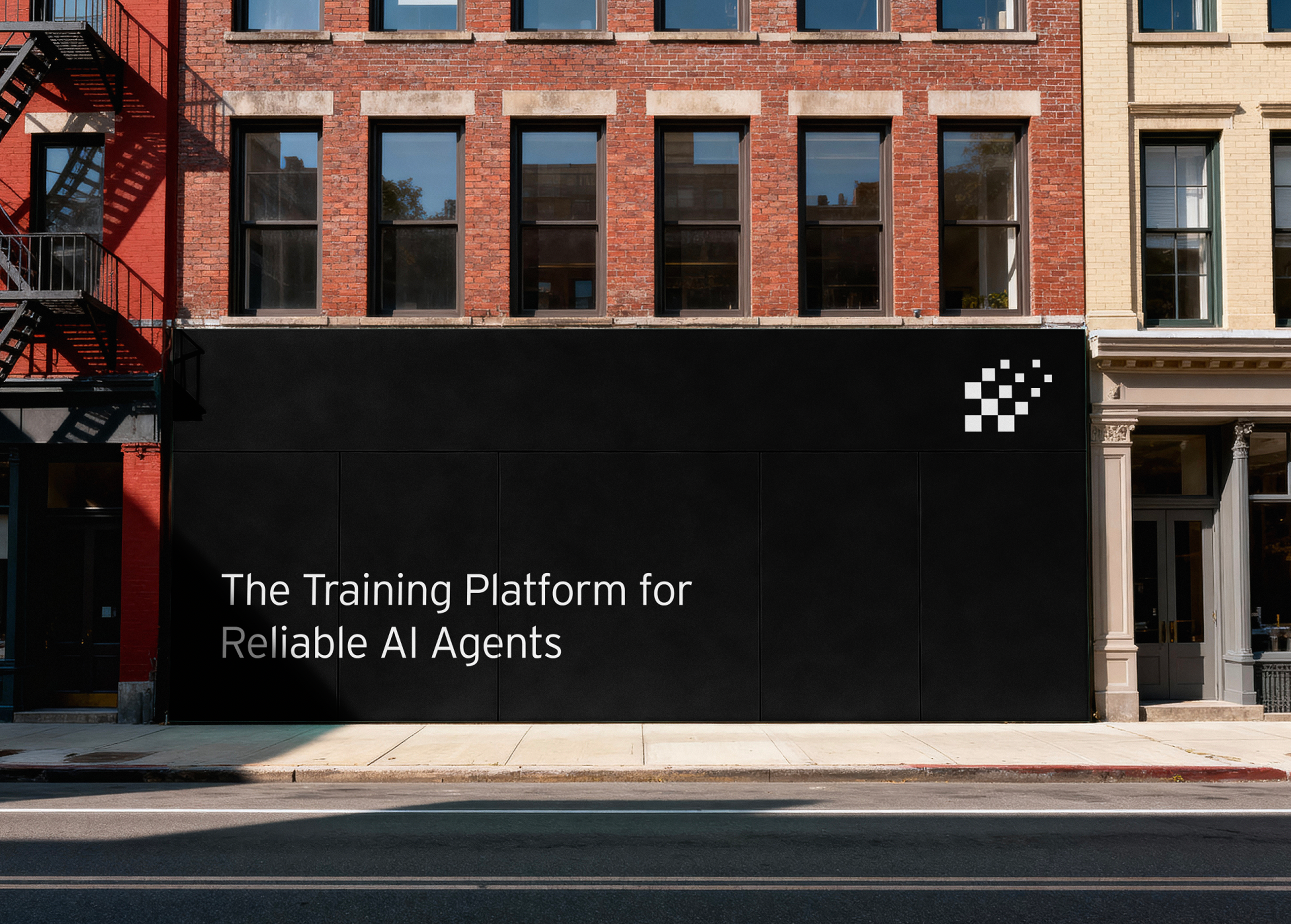
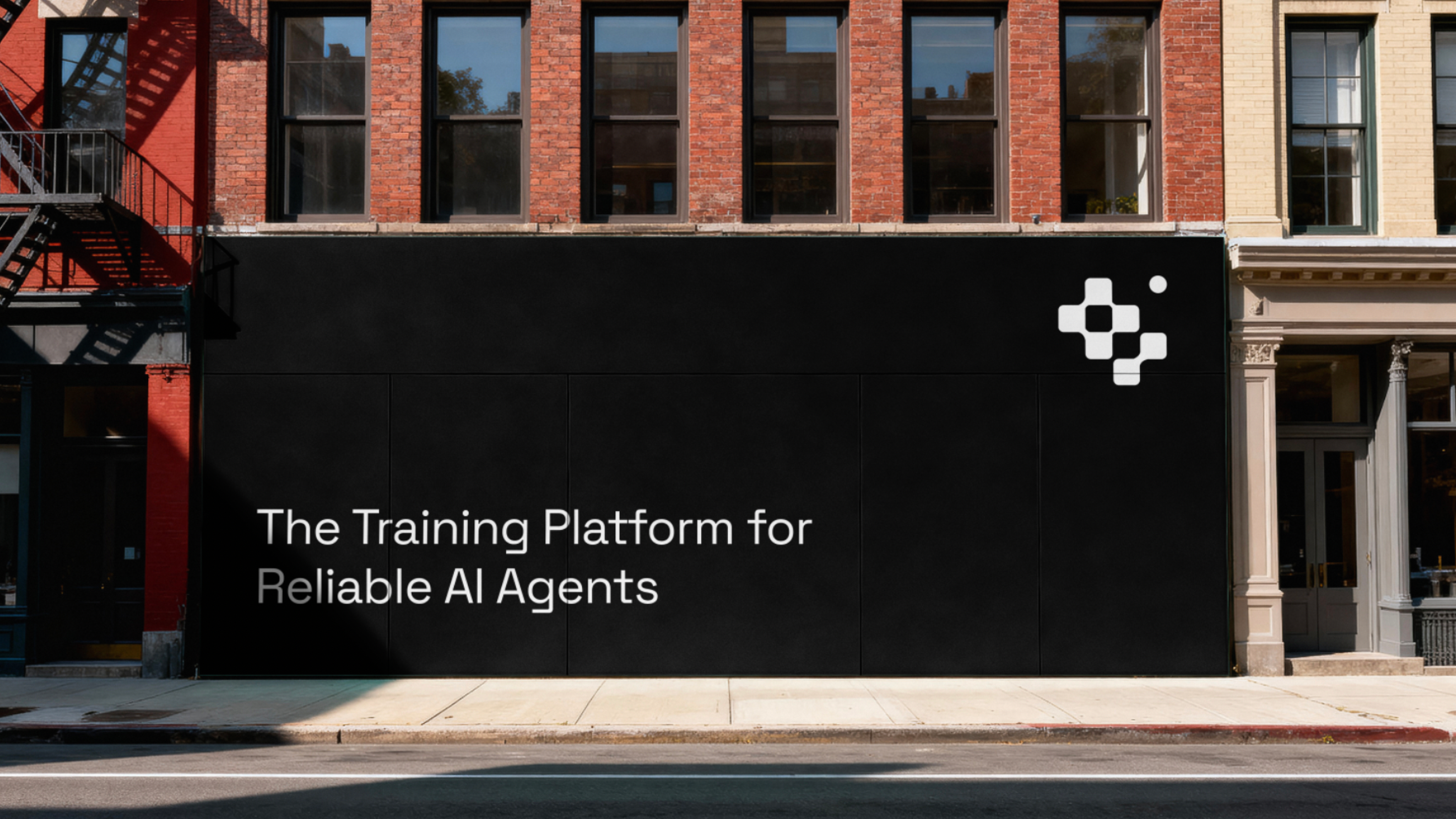
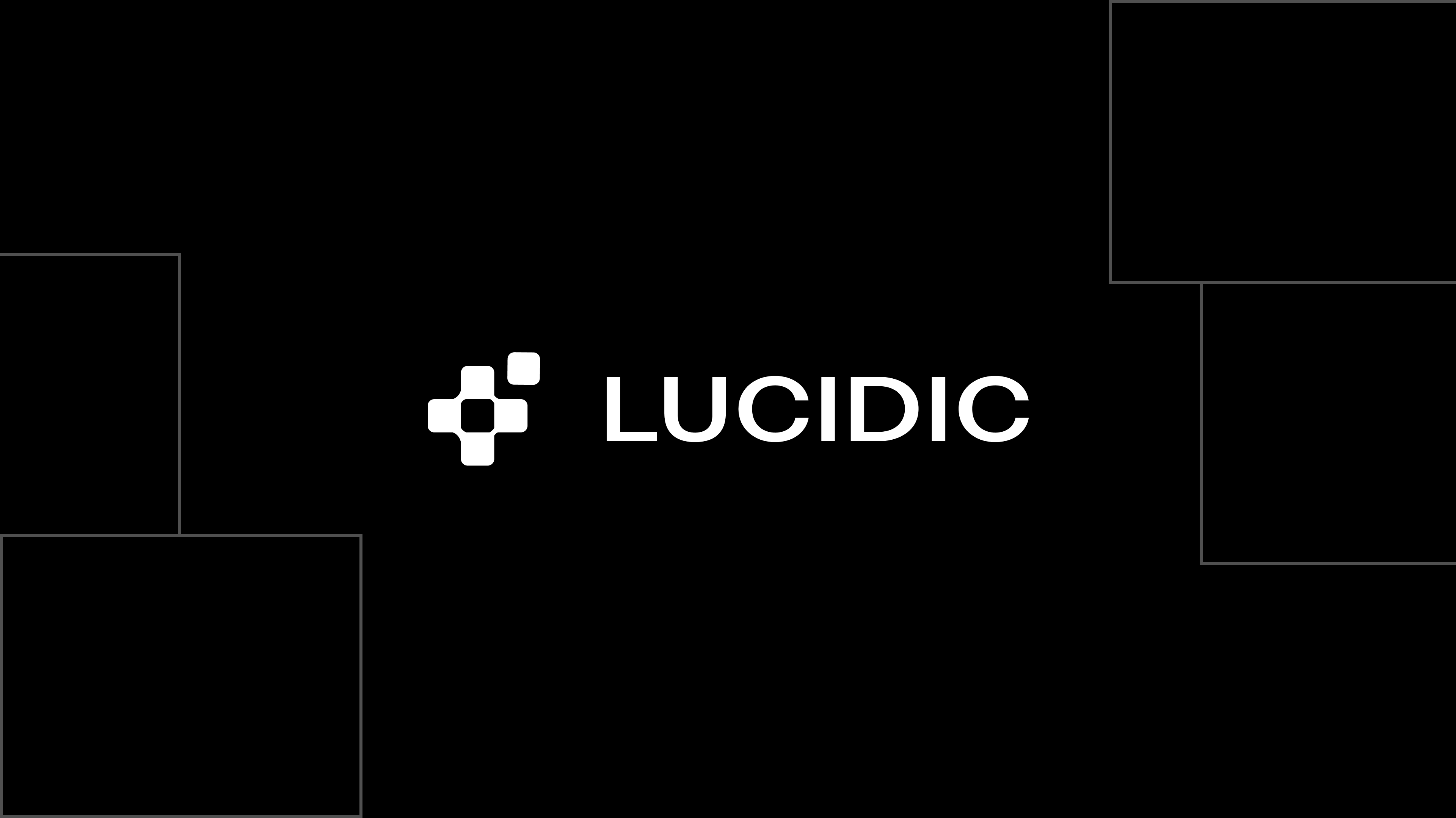
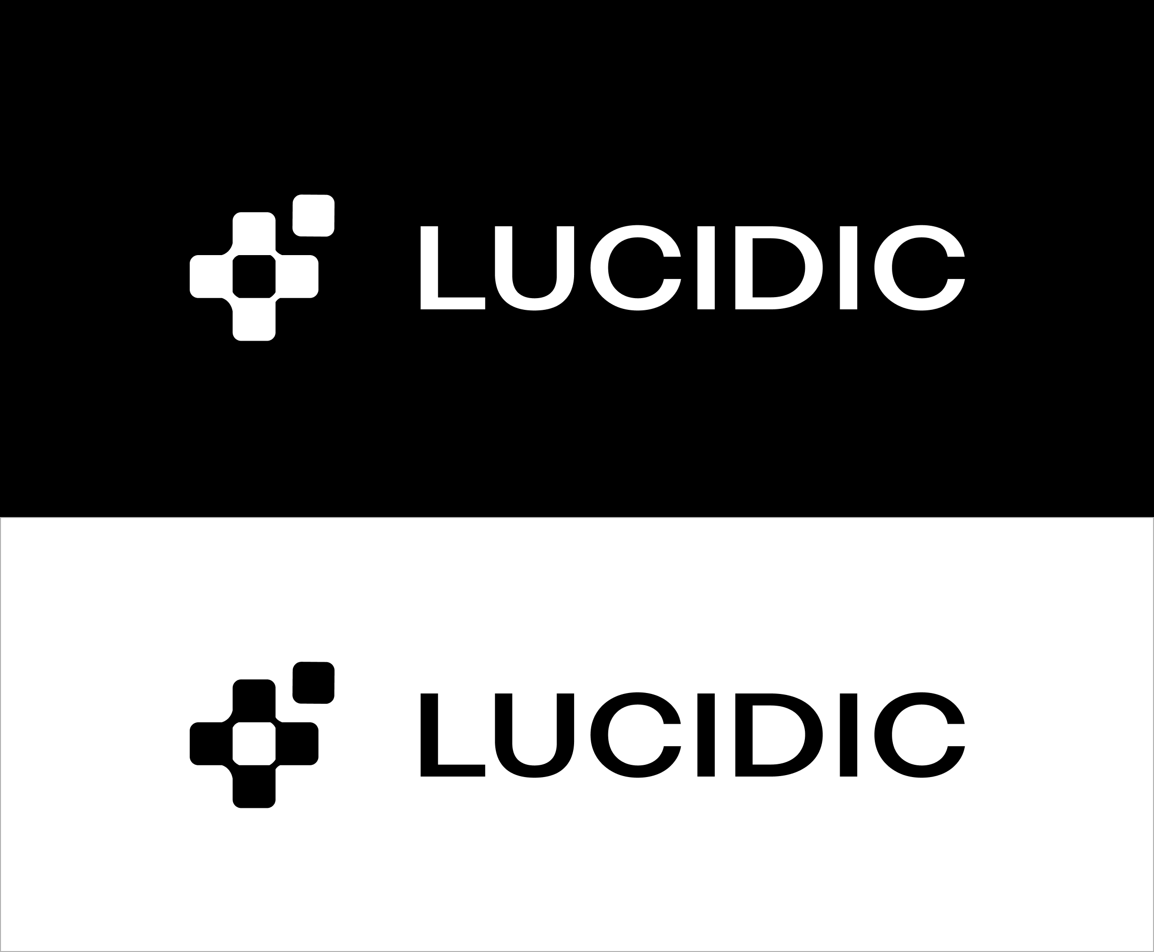
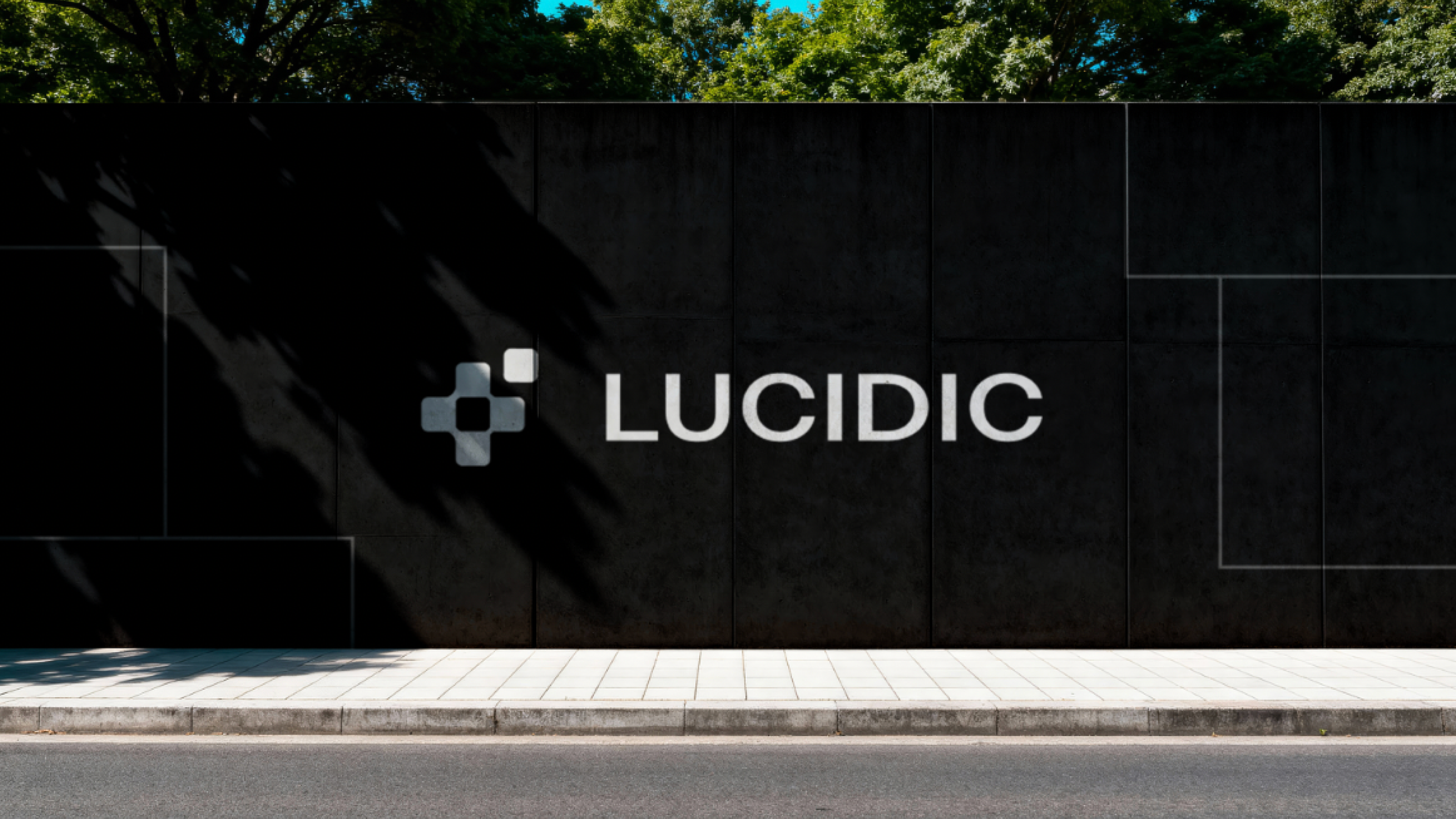
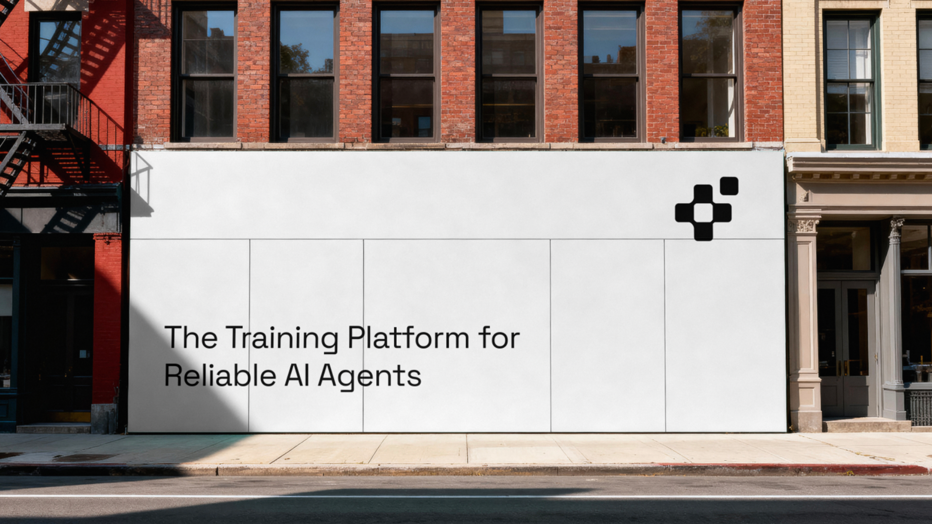
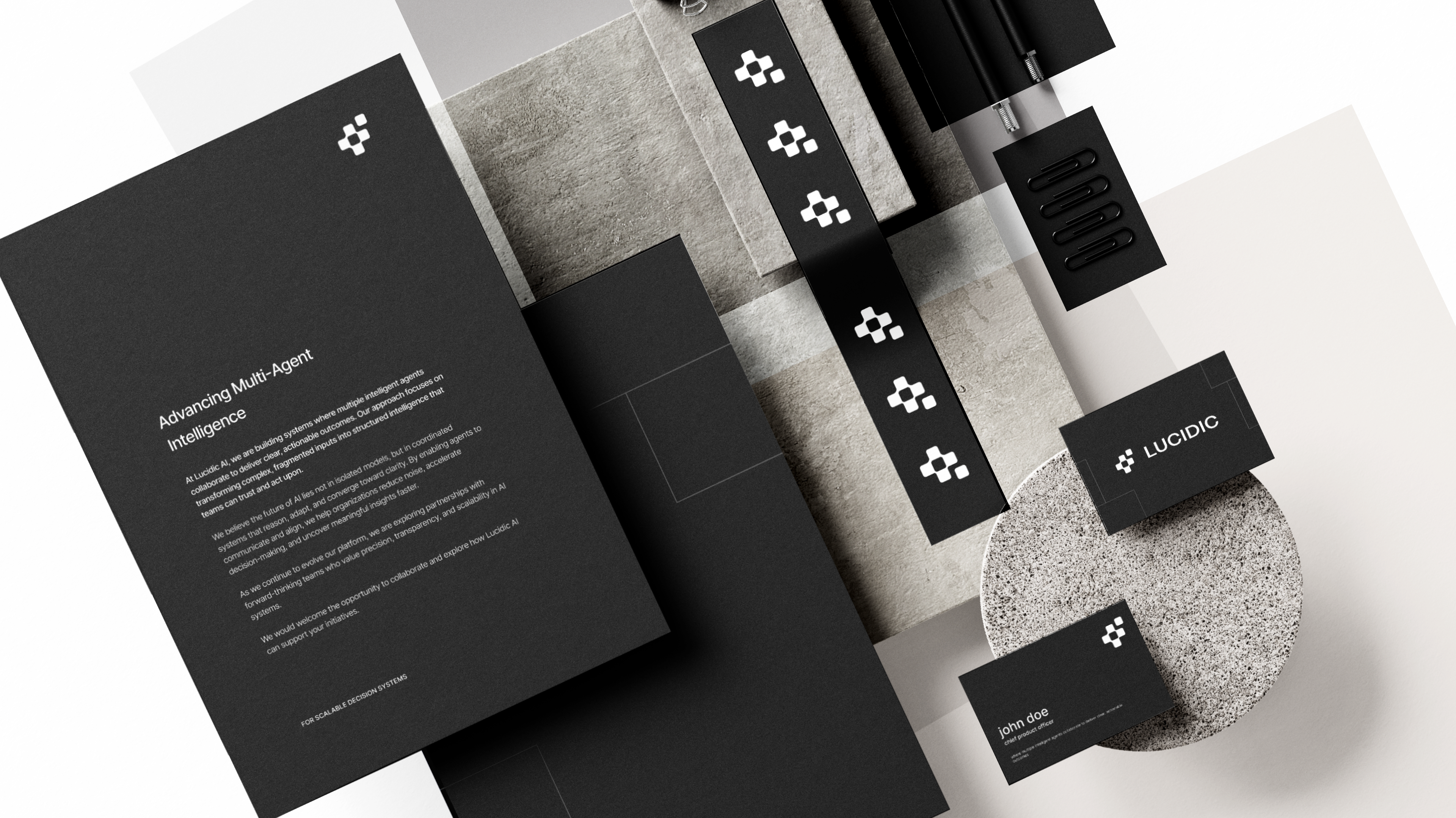
Stripped back to black and white with an uppercase wordmark and a dense, square-pixel mark. The most restrained, infrastructural direction of the four.

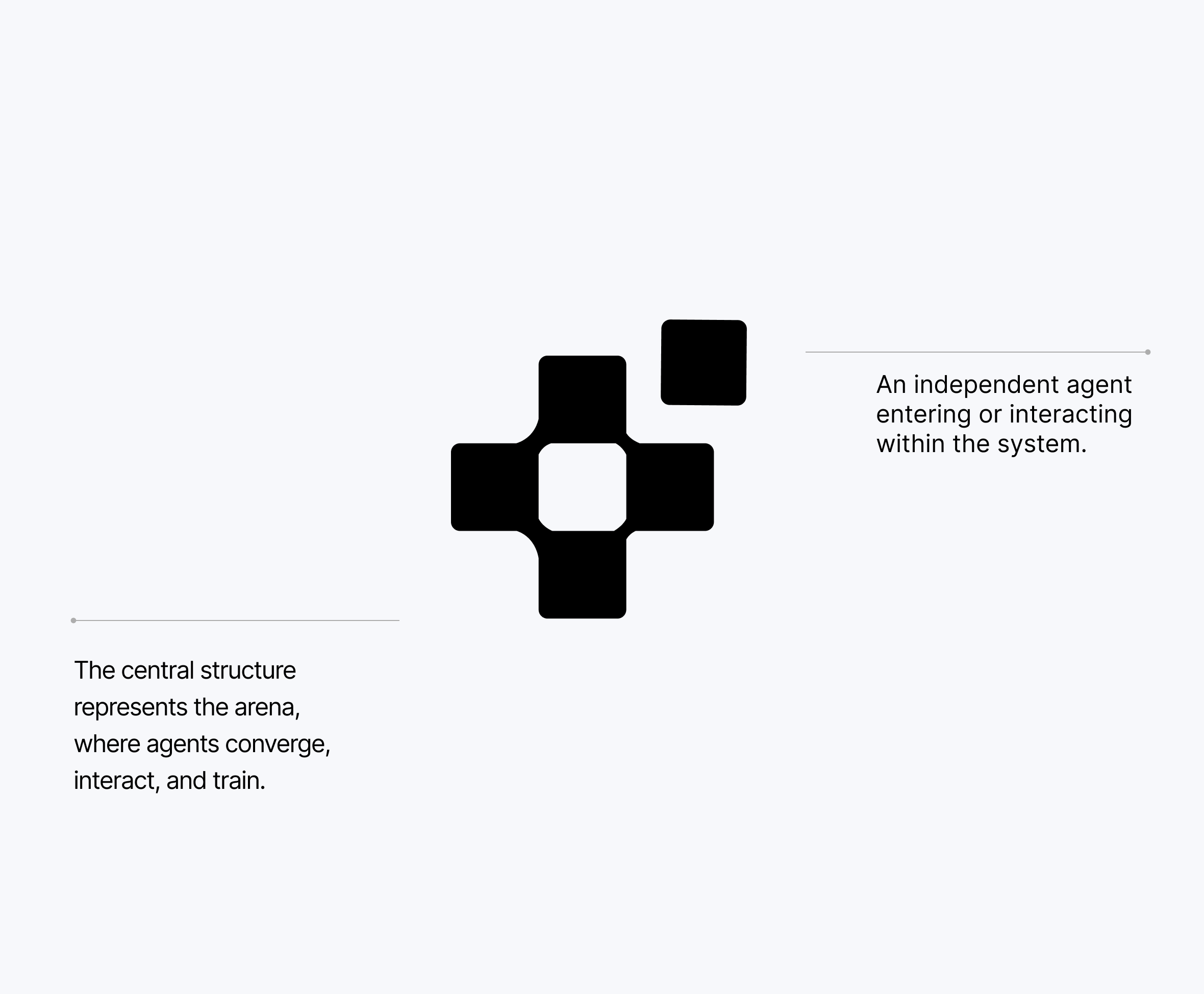

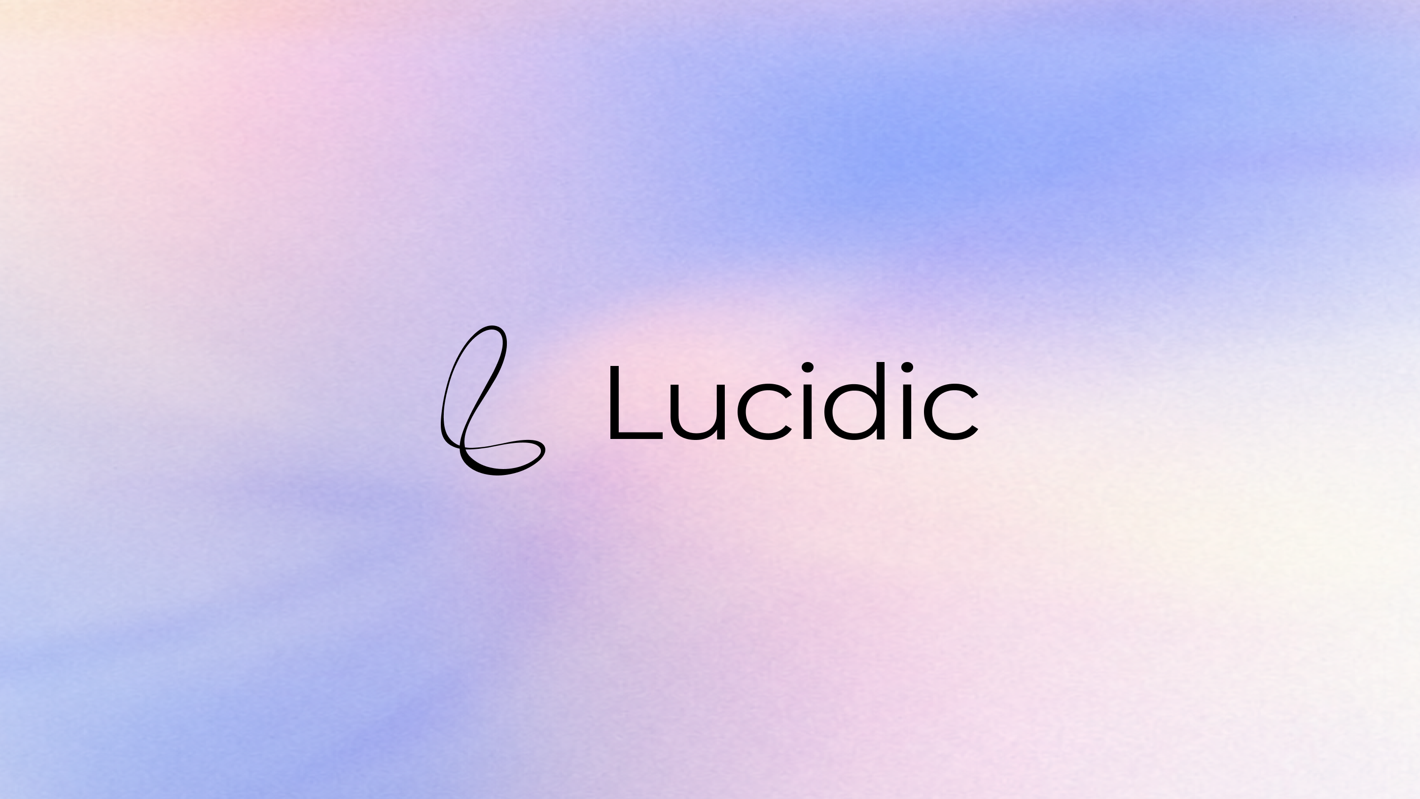
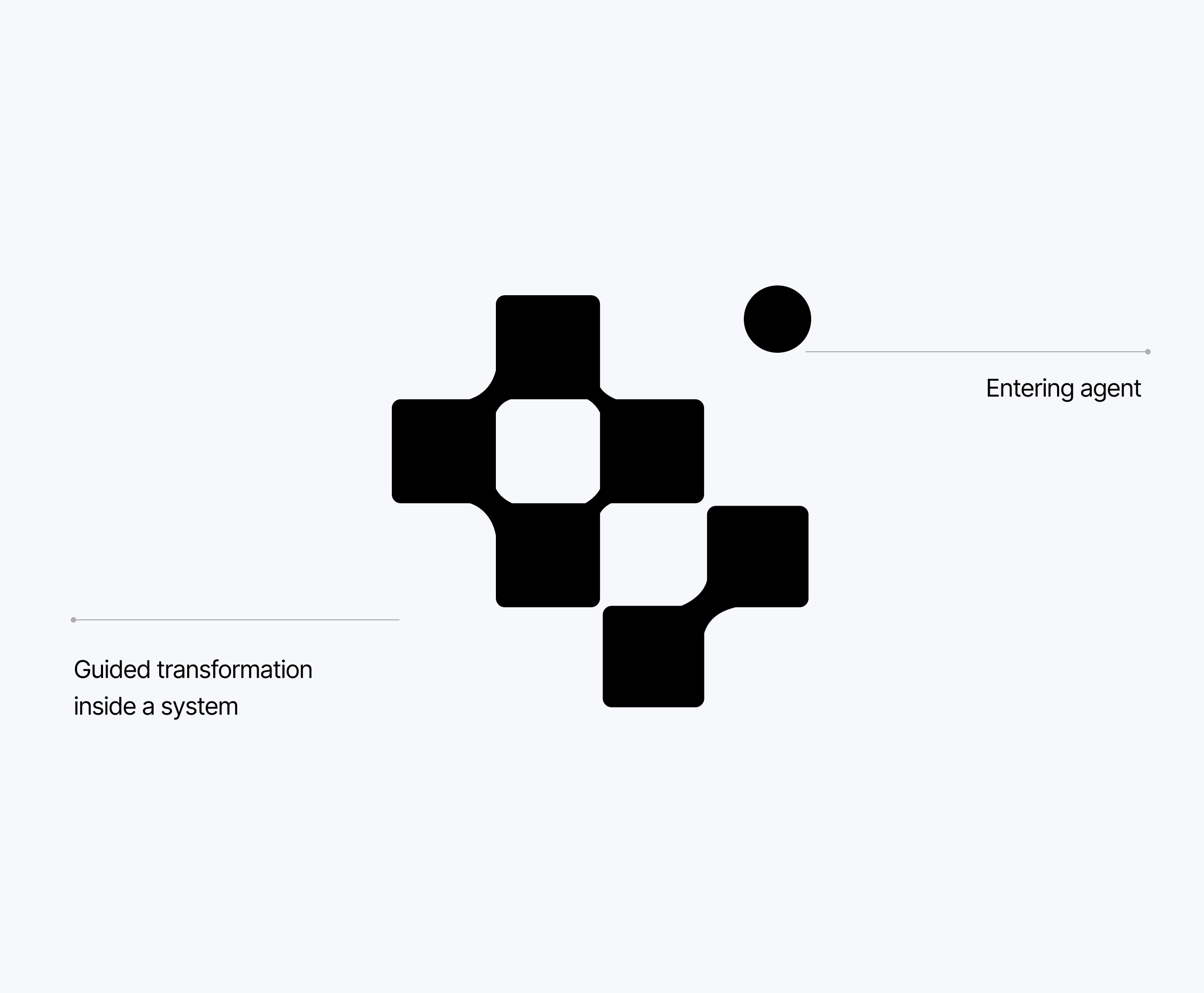
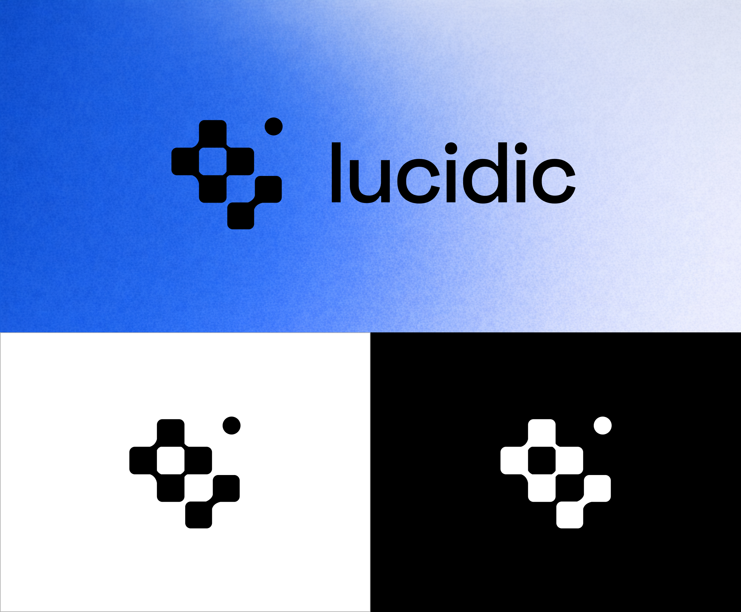
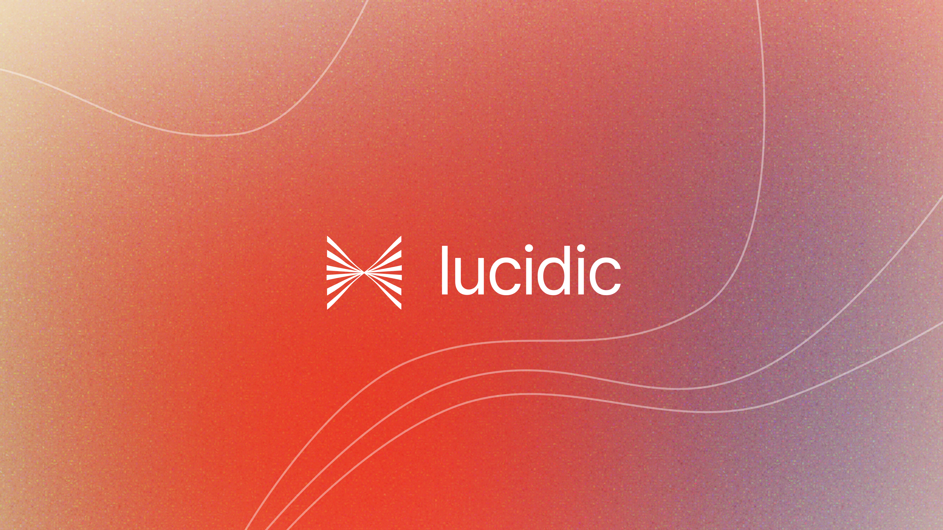
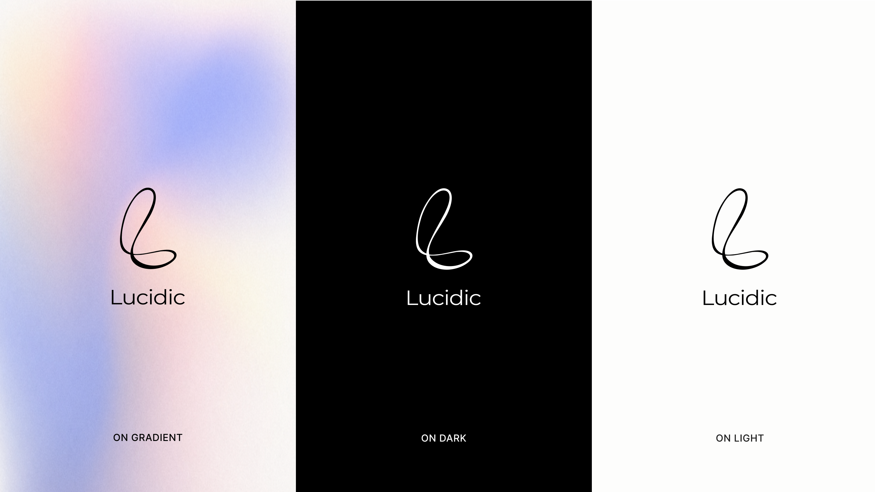
The chosen identity brings the warmth of the red and the calm of the blues together in a single lavender gradient, with one fluid mark that feels generative and alive. Clear, modern, and confident — the version that finally felt like Lucidic.
Final images coming soon...